Visualizing the relationship between infant mortality rates & resource availability
Posted by Sharan Duggal
Updated: Jul 22, 2016
Introduction
We know that war and civil unrest account for a significant proportion of deaths every year, but how much can mortality rates be attributed to a simple lack of basic resources and amenities, and what relationship do mortality rates have with such factors? That’s what I set out to uncover using WorldBank data that covers the globe for up to the last 50 odd years, and I found a strong relationship with some of the available data.
If you were to look at overall mortality rates, the numbers would be muddied by several factors, including the aforementioned causes of death, so I decided to look at two related, but more specific outcome variables – infant mortality as well as risk of maternal death.
Infant mortality is defined as the number of infants dying before reaching one year of age, per 1,000 live births in a given year.
Lifetime risk of maternal death is the probability that a 15-year-old female will die eventually from a maternal cause assuming that current levels of fertility and mortality (including maternal mortality) do not change in the future, taking into account competing causes of death.
While I am sure these numbers can also be impacted by things like civil unrest, it does focus on individuals who are arguably more subject to be impacted by things like communicable diseases and lack of basic provisions like clean water, electricity or adequate medical resources, among others.
So, what do overall mortality rates even look like?
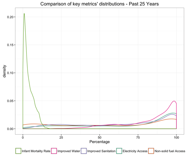
The density plot below includes the overall infant mortality distribution along with some metrics indicating the availability of key resources. Infant mortality rates peak at around 1% and the availability of resources peak closer to 100%. In both cases we see really long tails, indicating that there is a portion of the population experiencing less than ideal numbers.
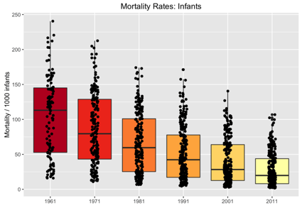
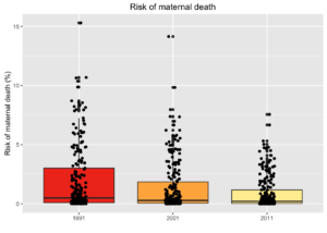
So to drill down further, let’s have a closer look at the distribution of both outcome variables by year. The boxplots below suggest that both Infant mortality rates as well as risk of maternal death have shown not only steady overall improvements over the years but also a reduction in the disparity of cases across country-specific observations. But the upper end of these distributions still represent shocking numbers for some countries with:
- over 10% of infants dying every year (down from a high of 24% in 1961) and
- a 7.5% probability that a 15 year old girl living today will eventually die of a maternal cause (down from over 15% twenty-five years ago).
Please note: points have been marginally jittered above for clearer visual representation
Mortality Rates across the Globe
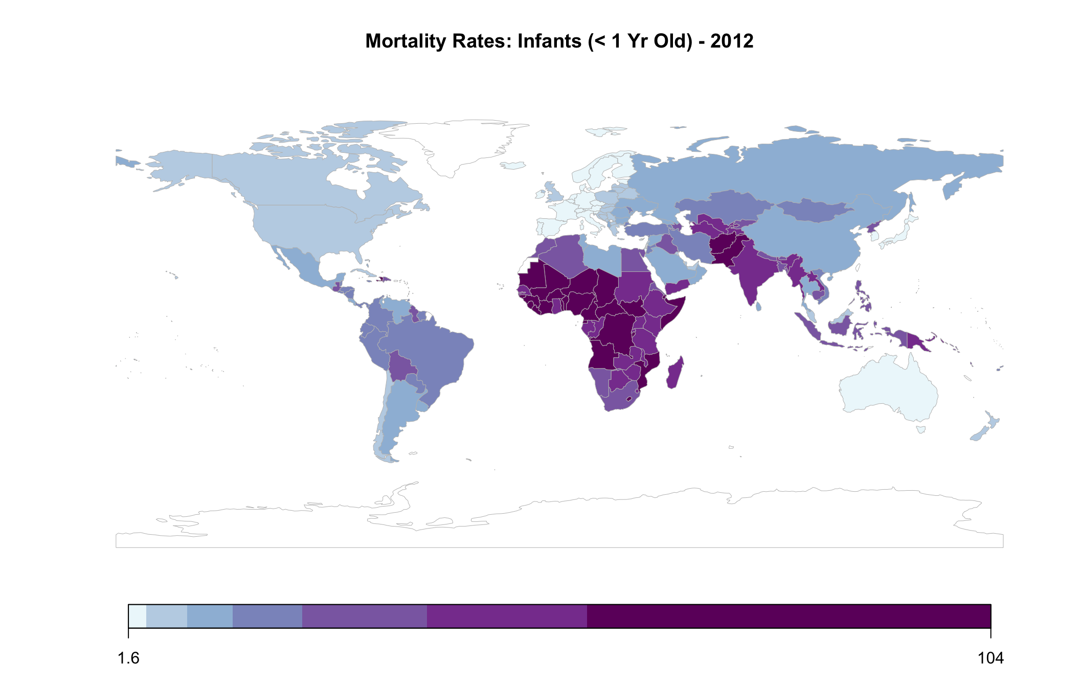
The below map plots the 2012 distribution of infant mortality rates by country. I chose 2012 because most of the covariates I would eventually like to use contain the best information from this year, with a couple of exceptions. It also presents a relatively recent picture of the variables of interest.
As can be seen, the world is distinctly divided, with many African, and some South Asian, countries bearing a bigger burden of infant mortality. And if it wasn’t noticeable on the previous boxplot, the range of values, as shown in the scale below is particularly telling of the overall disparity of mortality rates, pointing to a severe imbalance across the world.
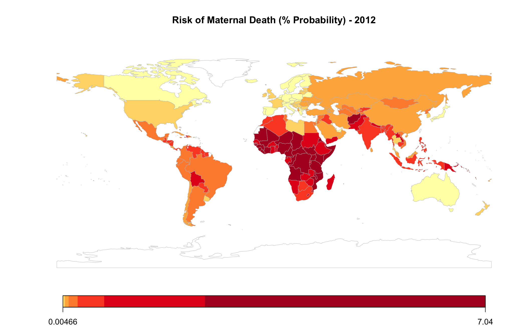
The map representing the risk of maternal death is almost identical, and as such has been represented in a different color for differentiation. Here, the values range from close to 0% to over 7%.
Bottom Ranked Countries Over the Years
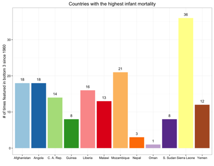
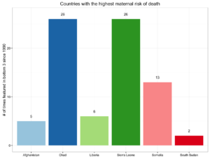
After factoring in all 50+ years of data for infant mortality and 26 years of data for risk of maternal death, and then ranking countries, the same set of countries feature at the bottom of the list.
The below chart looks at the number of times a country has had one of the worst three infant mortality rates in any given year since 1960.
The chart for maternal data goes from 1990 through to 2015. It’s important to note that Chad and Sierra Leone were ranked in the bottom 3 for maternal risk of death in every year since 1990.
Please note that numbers may be slightly impacted by missing data for some countries, especially for earlier years in the data set.
Relationship between Mortality & Resources
Getting back to the original question, are there any low hanging fruit and easy fixes for such a dichotomous situation? While my efforts during this analysis did not include any regressions, I did want to get an initial understanding of whether the availability of basic resources had a strong association with mortality rates, and if such a relationship existed, which provisions were more strongly linked with these outcomes? The findings could serve as a platform to do further research.
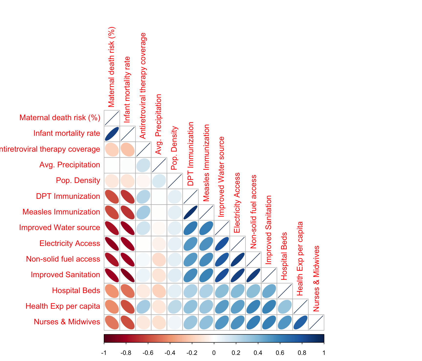
The below correlation analysis helped home in on some of the stronger linkages and helped weed out some of the weaker ones.
Note, the correlation analysis was run using 2012 data for all metrics, except for “Nurses and Midwives (per 1000 people)” and “Hospital beds (per 1000 people)” for which 2010 and 2009 data was used respectively, due to poorer availability of 2012 data for these measures.
Focusing on the first two columns of the above correlation plot, which represent risk of maternal death and infant mortality, we see a very similar pattern across the variables included in the analysis. Besides basic resources, I had also included items like availability of renewable freshwater resources and land area, to see if naturally available resources had any linkages to the outcomes in question. They didn’t and so they were removed from the analysis. In the plot above, it can also be seen that average rainfall and population density dont have much of a relationship with the mortality rates in question. What was also surprising was that access to anti-retroviral therapy too had a weak correlation with mortality rates in general.
The metrics that had the strongest relationship (in the 0.75 to 0.85 range) were:
- Percent of population with electricity
- Percent of population with access to non-solid fuel
- Percent of population with access to improved sanitation facilities, and
- Percent of population with access to improved water sources
The first two require no definitional explanation, but access to improved sanitation facilities ensure the hygienic separation of human excreta from human contact. Access to improved water sources refers to the percentage of the population using an improved drinking water source including piped water on premises and other improved drinking water sources (public taps or standpipes, tube wells or boreholes, protected dug wells, protected springs, and rainwater collection).
Analyzing the strongly correlating factors by Region
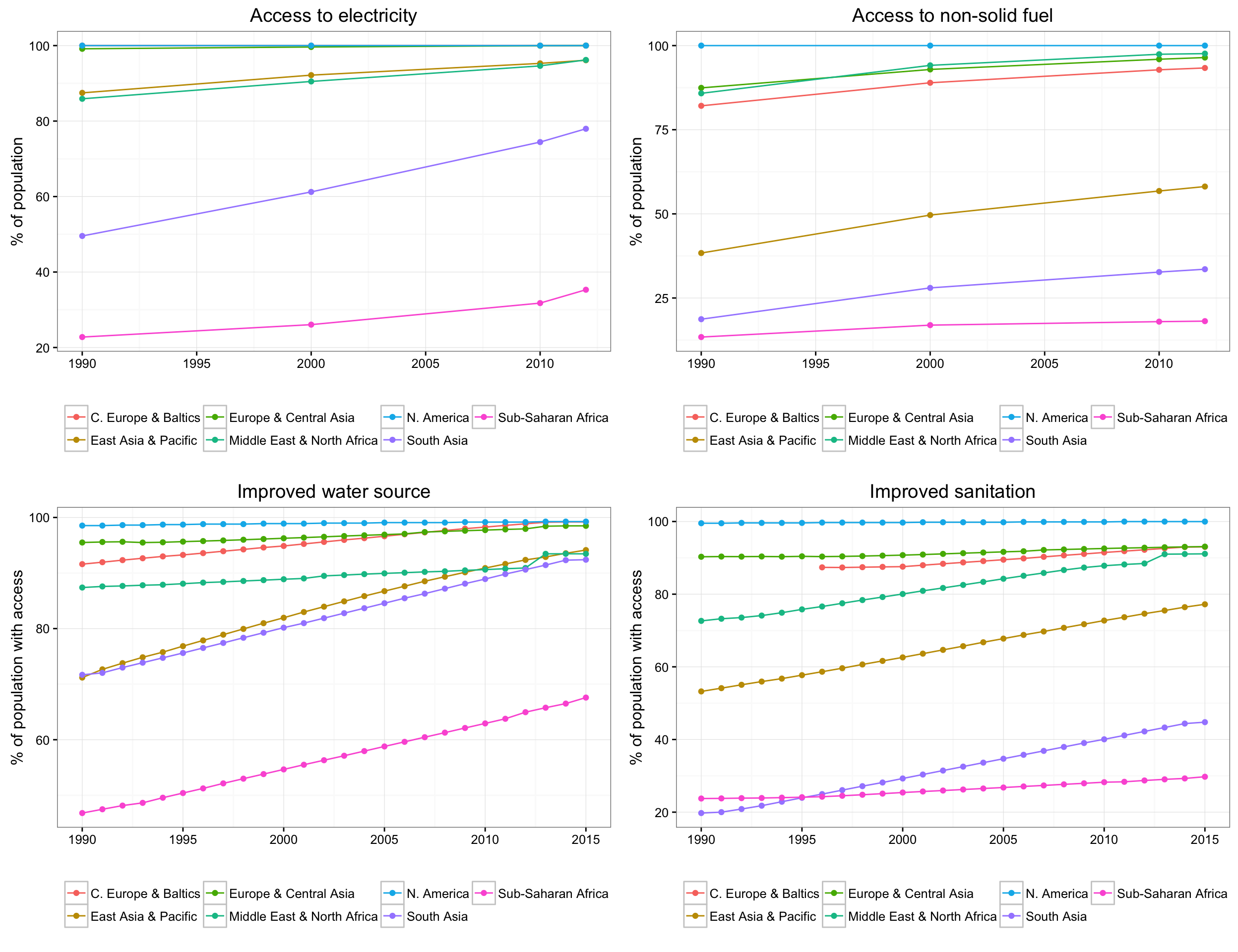
The following 4 charts look at regional performance of the key identified metrics. The pattern follows the same as that seen on the static world map from 2012, but this also gives us a view into how things have been trending on the resources that seem to be strongly linked with infant and maternal mortality over the past 25 years. We see a fairly shallow slope for Sub-saharan Africa on access to non-solid fuel as well as on improved sanitation facilities. Improvements in drinking water access have been much better.
South Asian countries ranked lowest on the provision of sanitation facilities in the early ’90s, but have made improvements since.
Conclusion
My analysis found a very strong relationship between mortality rates and basic provisions. It also weeded out some factors which were less important. As a next step, it may be helpful to do a deeper country-specific analysis for African and South Asian nations that suffer from a chronic lack of basic infrastructure, to see where investments would be most fruitful in bringing these countries to a closer state of parity with the developed world.
Sharan Duggal
View all articlesTopics from this blog: R R Visualization Student Works

