Contributed by Tyler Knutson. He is currently enrolled in the NYC Data Science Academy 12 week full time Data Science Bootcamp program taking place between July 5th to September 23rd, 2016. Code can be viewed in its entirety on GitHub.
Shiny app can be accessed here: https://tylerknutson.shinyapps.io/california_wine/
Context
Wine is big business in the United States, with over 8,000 wineries producing 600M+ gallons of wine per annum. Americans consume a lot of wine too: an estimated 845M gallons in 2014, more than any other nation on a total basis. Compare this to France -- the next closest country in terms of total consumption -- where citizens drink closer to 740M gallons annually. On a per capita basis the US ranks much lower relative to France (2.7 vs 11.2 gallons drank per person per annum, respectively), however this does not account for large differences in legal drinking age, and enforcement of these laws¹.
Nevertheless, the US is firmly established on the global wine map in terms of both supply and demand, but not all wines are created equal. Why does a chardonnay from Long Island, NY taste so different from one produced in the Willamette Valley, OR? What factors contribute to how grapes are grown, how wine is produced, and ultimately how it is priced and received by the wine community? And where are the best wines produced?
The answer to the former two questions lies in the complex relationship between climate, topography, grape varietal, soil (or terroir), winemaker style / skill, and a bit of luck (particularly with respect to the season's weather and potential disease outbreak). The latter question is more a matter of popular opinion: in general, when we think of the "best" wines from the US, we think of California and the Pacific Northwest. While recently Oregon wines have made great strides, including 2 wines in the top 10 of Wine Spectator's 2015 Top 100 list, traditionally California has produced some of the highest quality US wines.
A Brief History Lesson: The Judgment of Paris
But have so called "New World" wines from the US always found their place at the top of the world rankings? Unsurprisingly, in an industry dominated by traditionalists, the answer is no. Historically experts had largely considered French and other "Old World" wines to be the far superior products. This all began to change on May 24, 1976 at a wine tasting in Paris. French judges blind tasted and rated 4 premier French Bordeaux reds against 6 from California, and 4 white Burgundies against 6 California chardonnays. These French judges were shocked to learn they had rated a California wine best in both red and white categories. This was a pivotal moment in US wine history that established California as a true competitor in the space.
Fun fact: the Paris blind tasting included a 1973 Chateau Montelena chardonnay, a bottle of which recently sold at auction for over $11,000!
Exploring California Wine: The Data
Two datasets are visualized in my shiny app:
- Agricultural data²
- Published by USDA's National Agricultural Statistics Service
- Annual reports from growers listing by varietal (grape type) total tons crushed / purchased, average degrees brix, and average price per ton
- Filtered on grapes used to make wine only, 2010 to 2015 vintages
- Wine.com catalog data³
- API made available by retailer
- Lists data about each item in its catalog, including retail price, geo lat / long of vineyard, score (if available), and product type
- 96,000+ wines in inventory, filtered on 2010-2015 California vintages only (~9,000 unique bottles)
From Supply to Demand: Topics to Investigate with Shiny
Focusing on both the retail and supplier dimensions gives us a unique perspective of both ends of the wine value chain:

Shiny App Walkthrough
Agricultural Data
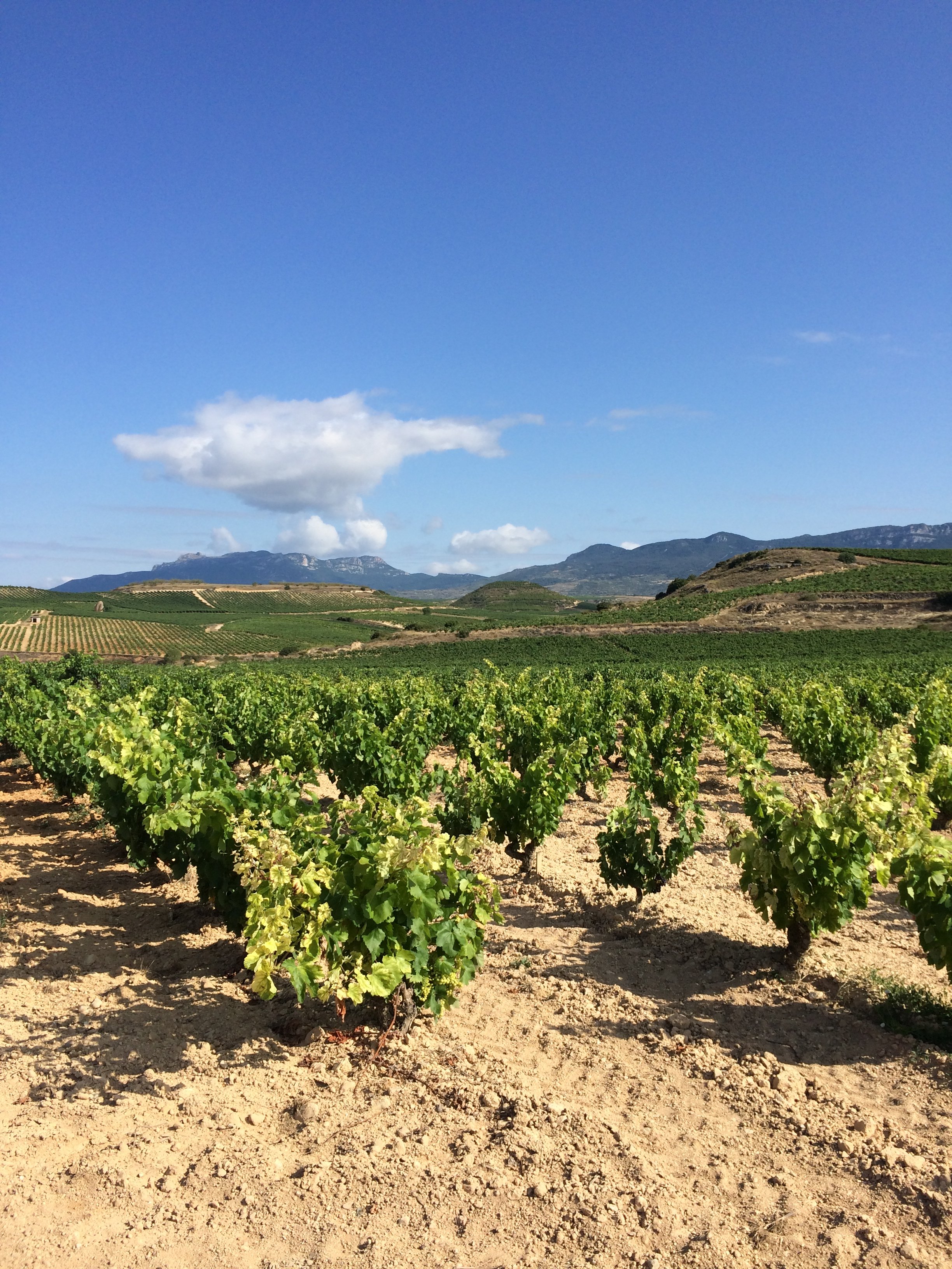
The first view presented here is a year-over-year at the agricultural data in an area of particular interest, Napa Valley:
Click to Enlarge
First it appears that production varies widely by vintage. In 2010 total tons crushed was approximately 140K, which dropped to 120K in 2011 and then skyrocketed to 180K in 2012. It was flat for two subsequent vintages then fell back to 2011 levels in 2015. Additionally, it does not seem that on average the total production has much of a relationship with average price, though it may be related to average degrees brix.
As many wine enthusiasts are aware, the quality and yield of a given growing season's crop is largely tied to the weather. It is not surprising to learn that 2011 was a particularly challenging year for Northern California grapes as it was marked with uncharacteristic periods of cold, wet, and fog. This posed a number of difficulties for winemakers as the harvest was delayed given that many grapes needed additional time to ripen as photosynthesis was limited by below average sunshine. The other interesting effect here was to produce historically low brix levels. Brix is a measure of sugar content and is directly related to the alcohol levels of wines produced (as sugar converts to alcohol upon fermentation), and is inversely related to acidity levels.
The Shiny app can filter by varietal and I was also curious how two of my favorite varietals compared to total production in Napa Valley over the same period, so I filtered on All Grapes, Chardonnay, and Cabernet Sauvignon:
Click to Enlarge
It seems that these two grapes alone comprise approximately 60% of all Napa Valley production, a ratio that stays mostly in line over the six vintages. Price per ton shows that cabernet grapes are above average while chardonnay grapes are slightly below, which is not surprising given the number of iconic cabernets that have come from the region. It is interesting to note that cabernet prices have increased by over 40% since 2010 while chardonnay prices have increased by only 17% over the same period.
The impact on average brix levels is fascinating. While each winemaker has different preferences on desired brix levels depending on varietal, typically higher brix levels are caused by dehydration and can lead to crop yield losses as bunches of grapes compete for limited water. It is interesting to see that cabernet prices increased so dramatically in concert with brix levels; one possibility could be that winemakers paid more for higher brix fruit, which may have limited growers' yields.
Wine.com Catalog
Now I'm curious about 2013 Napa Valley cabernets. The agricultural data is suggesting something dramatic happened in that vintage, so let's take a look at Wine.com's inventory and understand how retail prices, volume, and value vary in the region:
Click to enlarge
So it looks like Wine.com has 157 different bottles to choose from for this vintage and varietal! The average retail price is $73 and average score is about 93 points, with an average "value" rating of 1.1 (ratio of score to price for wines scoring 93+ points). This baseline information will be useful as I attempt to understand how various bottles differ and I make my selection.
In general there seems to be a large concentration of dark red circles, which shows that in general the cabernets in this region are higher priced than other varietals and regions as the shading is on an absolute scale for the vintage. So, if we want 2013 Napa cabernet, we're going to have to pay a premium over other 2013 grapes and appellations.
Click to Enlarge
Now if I change the heatmap scale to focus on value rating instead of price, I can see that despite Napa cabernets being more expensive, they do not seem to have a commensurate increase in "value" as measured by scores. In general the circles are much less opaque when displaying value rating, which demonstrates that relative to other appellations or varietals our selection does not have a high concentration of bargain wines for the price.
Click to Enlarge
Here I have selected what visually appears to be the darkest circle (highest score to price ratio) and can see information on Black Stallion Winery, which produced a 93 point cabernet that retails for just $30. If this sounds like a steal (it is), we can confirm by comparing its value rating of 3.1 to the baseline of 1.1. If we examine the price to score scatter plot on the righthand side of the app we can confirm that this wine is the least expensive of all 2013 Napa Valley 93 point cabernets. I have never tried this wine and will definitely add it to my collection at this price.
Let's check one more thing: 2011 Napa chardonnay. We already saw that production was limited by weather, and average brix levels were extremely low for this grape, producing a much higher acid content and lower alcohol levels. While this sounds like a recipe for disaster -- indeed, Robert Parker rated this vintage extremely unfavorably -- I recall enjoying a fine bottle with dinner one evening.
Click to Enlarge
Average 2011 Napa Valley chardonnays scored 91 points, but this memorable bottle from my favorite winemaker from a bad vintage scored 94 points! Apparently I favor chardonnays with higher acidity that still scored high despite poor conditions.
Technical Details
This section describes some of the technical steps I took to create my Shiny app and contains several code snippet examples where relevant.
Agricultural Data
No involved steps were necessary other than consolidating several csv reports from the USDA website into one master csv, which I simply imported into R.
Wine.com API
Importing the Wine.com catalog required a number of steps including parsing the JSON response file, traversing the nested hierarchy to locate the desired fields, and iterating through the file to write the results as a dataframe to a structured csv file, which I could then import into R.
Parsing the JSON response:
https://gist.github.com/tylerknutson/ea3de365ddaae5d10eb8430e0dc79279
Locating the desired fields:
https://gist.github.com/tylerknutson/c1df9fac7694b5cdbf00d926a8cca949#file-api_traverse
Converting to dataframe:
https://gist.github.com/tylerknutson/c1df9fac7694b5cdbf00d926a8cca949#file-api_dataframe
Writing to csv:
https://gist.github.com/tylerknutson/c1df9fac7694b5cdbf00d926a8cca949#file-api_csv
Structuring the Data
Since I want the user to be able to use a variety of filters, including the ability to select "all" (e.g., "All Grapes", "All Types", "All Appellations"), I decided for simplicity to leverage two summary tables: one for the agricultural data, and another for the Wine.com catalog data. Basically this involved creating a number of explicit groupings that set the non grouped fields equal to "All"; so there would literally be rows with values of "All Grapes", for example, that the Shiny filter objects could pick up. I then used the handy sqldf package to quickly create the summary table by joining to the various grouping tables available.
Example of agricultural data groupings:
https://gist.github.com/tylerknutson/c1df9fac7694b5cdbf00d926a8cca949#file-agro_grouping
Example of using sqldf package to append to summary table:
https://gist.github.com/tylerknutson/c1df9fac7694b5cdbf00d926a8cca949#file-agro_sql
I then applied similar steps to group and summarize the Wine.com API data.
Unfortunately the concept of region varies between the two datasets, so I was forced to crudely reconcile the USDA's official districts to Wine.com's appellations.
Creating a district to appellation crosswalk:
https://gist.github.com/tylerknutson/c1df9fac7694b5cdbf00d926a8cca949#file-region_xwalk
Putting it All Together in Shiny
I created the map object using Leaflet, which included a neat bit of functionality to vary the scale used to determine opacity (i.e. how "dark" the shading is to represent concentration). I allow the user to decide whether he/she wants to see shading based on price, volume, or value rating. Luckily the Wine.com API includes geo lat/long for each winery so we can easily plot their locations.
Creating the Leaflet map in server.r file:
https://gist.github.com/tylerknutson/c1df9fac7694b5cdbf00d926a8cca949#file-leaflet_map
I used GoogleVis charts to display the agricultural data, which involved an interesting challenge in that the number of y variables needed to be dynamic as the user can select one or many varietals. In order to handle this requirement I leveraged the spread function in R to restructure the data and create a column for each varietal containing y values, which would then be filtered based on the user's filter selection.
Creating the "Average Price per Ton" chart in GoogleVis in server.r file:
https://gist.github.com/tylerknutson/c1df9fac7694b5cdbf00d926a8cca949#file-googlevis
Next Steps
With additional time it would be interesting to make use of other elements of these datasets and to continue to modify the Shiny app. My top priorities would include:
- Minor fixes (e.g., formatting of GoogleVis tooltips)
- Adding a global tab with ability to visualize price / score by varietal by additional regions (e.g., Burgundy vs Napa Valley)
- Expanding scope to include additional vintages
Cited Sources
Topics from this blog: Student Works