 Contributed by Sricharan Maddineni. He is currently in the NYC Data Science Academy 12 week full time Data Science Bootcamp program taking place between January 11th to April 1st, 2016. This post is based on his second class project - R Shiny (due on the 4th week of the program).
Why Are Airports Important?

(Photo by theprospect.net)
Aviation infrastructure has been a bedrock of the United States economy and culture for many decades, and it was the first instrument through which we connected with the world. Before the invention of flight, humans were inexorably confined by the immenseness of Earth's oceans.
All the disdain and unpleasantries we endure on flights are quickly forgotten once we safely land at our destinations and realize we have just been transported to a new place on our vast planet. Every time I have flown and landed in a new country or city, I am overwhelmed with feelings of how beautiful our world is and how much I wish I could visit every corner of our planet. My love of aviation has led me to investigate the connectedness of United States airports and the passenger-disparity between the developed and developing countries.
Click here to try the app!
The App
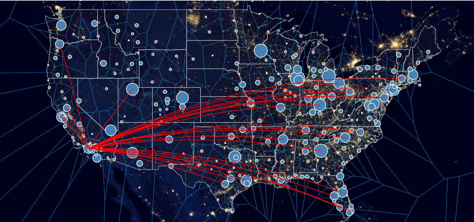
The interactive map can be used as a tool to investigate the connectedness of the US airports. Users can choose from a list of airports including LAX, JFK, IAD and more to visualize the connections out of that airport. The 'Airport Connections' table shows us the combinations of connections by Airline Carrier. For example, we can see that American Airlines (AA) had 8058 flights out of LAX to JFK (2009 dataset). The 'Carriers' table shows us the total flights out of LAX by American Airlines (76,670).
If we select Hartsfield-Jackson Atlanta International, we see that it is the most connected airport in the United States. *Please note that I am not plotting all possible connections, just major airport connections and only within the United States (the map would be filled solid if I plotted all connections!). The size of the airport bubble is calculated by the number of connections. Therefore, all large bubbles are international airports and smaller bubbles are regional/domestic airports.

I also plotted Voronoi tesselations between the airports using one nearest neighbor to show the area differences between airports in the Eastcoast/Westcoast/Midwest. The largest polygons are found in the Midwest because airports are far apart in all directions. These airports are generally more connected as well since they are connecting the east and west coast (see Denver International or Salt Lake City International). Clicking on a Voronoi polygon brings up the nearest airport within that area.
Why is it important for countries to improve their airport infrastructure?
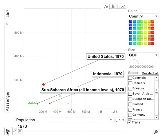
Looking at the Motion/Bubble Chart, we observe that developing countries travel horizontally whereas developed countries travel vertically. This indicates that developed countries populations have remained steady but they have seen a rise in passenger travelers. On the flip side, developing countries have seen their populations boom but the number of air travelers![]() has remained stagnant.
has remained stagnant.
Most importantly, countries moving upward show noticeable gains in GDP whereas countries moving horizontally show minimal gains over the last four decades (GDP is represented by the size of the bubble). We can also notice that airline passenger counts plunge during recessions for first world countries but remain comparatively steady for developing countries (1980, 2000, 2009). We can interpret this to mean that developing countries are not as connected to the rest of the world since their economies are unaffected by global economic crises.
Passenger Counts during weekends and Holidays
The calendar heatmap shows us the Daily flight count in the United States. We can recognize that airlines operate significantly fewer flights on Saturdays and National Holidays such as July 4th and Thanksgiving. The days leading up to and after National Holidays show an increase in flights as expected. Looking carefully, you can also notice there are fewer flights on Tuesdays and Wednesdays, and there are more flights during the summer season.
If you select a day on the calendar, a table shows us the top 20 Airline carrier flight counts on that day. Southwest, American Airlines, SkyWest and Delta seem to operate the most airlines in the United States.
Click here to try the app!
The Data
1. Interactive Map
I utilized comprehensive datasets provided by the United States Department of Transportation and Open Data by Socrata that allowed me to map airport connections in the United States. The first airport dataset included airport locations (city/state) and their latitude and longitude degrees, and the second dataset included the airport connections (LAX - JFK, LAX-SFO, ...). First I used these datasets to calculate the size of the airport based on how many connections each had.
https://gist.github.com/sriyoda/01171d8d286a10fa2884
2. Motion Chart
The second analysis was done using the airline passenger, population, and GDP numbers for the world's countries over the last 45 years. Most of the work here was in transforming the three datasets provided by the World Bank from wide to long. See the code below.
https://gist.github.com/sriyoda/6c514e13737afaa043ba
3. Calendar Chart
Lastly, I used the Transtats database to obtain the daily flight counts by Airline Carrier for the years 2004-2007. Some transformation was done to create two separate data frames - flight counts per day and flight counts per carrier. While trying to calculate flight counts by day, I tried this code:
f2007_2 <- f2007 %>% group_by(UniqueCarrier, month) %>% summarise(sum = n())
I knew there as an error by looking at the resulting heatmap but I didn't realize this was showing me a cumulative sum by month rather than the daily flight count, so I hit twitter to see if I could get help diagnosing my problem. I tweeted Jeff Weis who appeared as the Aviation Analyst on CNN during the Malaysian Airlines MH370 disappearance and he caught my mistake! After he pushed me in the right direction, I corrected my code to:
group_by(UniqueCarrier, date) %>% summarise(count = n())
@sriyoda I'd guess you're looking at cumulative # flights to date, w/ counter reset to 0 at start of each month?
— Jeff Wise (@ManvBrain) February 8, 2016
@sriyoda Cool!
— Jeff Wise (@ManvBrain) February 18, 2016
https://gist.github.com/sriyoda/be1216082c518d2d2343
The Code
Creating Voronoi Polygons
https://gist.github.com/sriyoda/2e98a50bedfdbed7be63
Connection Lines
The second step was creating the line connections between the airports. To do this, I used the polylines function in Leaflet to add connecting lines between airports filtered by user input. input$Input1 catches the user selected airport and subsets the dataset by all origin airports that equal the selected airport. The gcIntermediate function makes those lines curved.
https://gist.github.com/sriyoda/59a1c7de8e03e9842743
Calendar json capture
The calendar chart required two parameters, the datevar which reads the date column, and numvar which plots the value for each day on the calendar. Then I utilized a gvis.listener.jscode method to capture the user selected date and filter the dataset for the table.
https://gist.github.com/sriyoda/96552588a4c1c1d2e7eb
Topics from this blog: R Student Works R Shiny