2016 in songs on Germany's most popular radio station
Posted by Stefan Heinz
Updated: Feb 18, 2017
Introduction
This post is about the second of the four projects we are supposed to deliver at the NYC Data Science Academy Data Science Bootcamp program. The requirements were:
For this project, your primary task is to collect data from a web source by method of
scraping. What you do with that data after its collection is up to you (e.g., numeric
description, basic/interactive graphics, machine learning, etc.); however, you still must
lead the audience through an overall insight. While it is required you scrape your data
using Python, the analyses following are language agnostic – but remember that the
primary task is to foster data scraping skills.
After looking for a unique and interesting subject matter, I decided to base this project on the songs that were played throughout the whole year 2016 on Germany's most popular radio station SWR3.
Code and data can be found on GitHub, while the app itself is online at shinyapps.io.
Data Source
SWR3 is part of the regional public broadcasting corporation Süwdestrundfunk (SWR, "Southwest Broadcasting"), servicing the southwest of Germany (Source: Wikipedia). On their website swr3.de, they offer the possibility to explore which songs were played on any given day at any given time.
Time and day can be selected by two dropdown filters on the top of the page, both implemented as select elements. By clicking the submit button, the page is reloaded with two parameters added to the URL in the format: ?hour=10&date=2017-02-18. This makes it especially easy to navigate through a given date range and get all the songs played in this range.
From each page for each hour of a day it was then possible to get each date, time, artist and title that were played during this hour. To retrieve the content of these elements I used the Python package Beautiful Soup and employed CSS selectors to extract the elements one by one. The four elements describing one entry were saved as a dictionary, while the data for the whole hour was saved as a list of dictionaries, which in turn was appended to an overall list which stored data for the whole execution of the script, usually a month at a time. The data was then written to a CSV file.
Source Data
I ended up making 24 * 366 = 8.784 HTTP requests to the SWR3 playlists page, one for each hour of each day of the leap year 2016. I did this in blocks of months for two reasons: breaking down the overall scraping time into several chunks, and trying to not get banned from the webserver. I ended up with 12 CSV files - one for each month - which were combined into one large CSV file consisting of 113,174 rows and 4 variables:
| date | time | artist | title |
After some date/time arithmetics I ended up with the final CSV file consisting of 113,174 rows and 16 variables:
| date | time | artist | title | ts | day | month | year | wday | wdayLabel | wk | qrtr | hr | min | rushHour | season |
Most of the variables are straightforward. However I would like to explain two of them in more detail:
- rushHour {morning, evening, NULL}: the value in this column determines whether a song was played during one of the rush hours of the day, with them being defined as:
- morning: 06:00am - 08:59am
- evening: 04:00pm - 06:59pm
- only on weekdays (Mon - Fri)
- season {winter15, spring, summer, fall, winter16}: the value in this column determines in which season of the year a song was played, with them being defined as:
- winter15: 2015-12-01 - 2016-02-29
- spring: 2016-03-01 - 2016-05-31
- summer: 2016-06-01 - 2016-08-31
- fall: 2016-09-01 - 2016-11-30
- winter16: 2016-12-01 - 2017-02-28
The data was in very good quality so that I had to only some light cleaning. Usually, the artist is stated on the website as LastName, FirstName. Sometimes however it might be listed as LastName,FirstName. The reason for this is unclear. I used regular expressions to catch each of the occurrences of the latter form and then converted them into the one mentioned first. When a song had two or more artists, this substitution was applied to each of the artists.
Also, some hours might be missing songs, especially when the song count for an hour was much lower than the average of 12.8. This might be due to an error in webscraping but might as well be due to special programming of the radio station.
Data Aggregates
Up until now I was working in Python for scraping the data and computing the date/time arithmetics. For creating data aggregates for the final visualization I switched to R.
Based on the CSV file mentioned above, the following aggregates were created:
- distinctSongs: Grouping of playlist entries by artist and title to to count the overall occurrence, or playcount, as well as first day and last day of appearance on the program for each song in the year 2016.
- songsPerArtist: Grouping of distinct songs per artist to count the number of distinct songs that were played by an artist.
- songsPerDate: Grouping of songs per date to count the number of songs played on each day of the year.
- songsPerHour: Grouping of songs per hour to count the number of songs played per hour of day.
All of these aggregates are calculated on the fly because the user is able to filter the underlying data source using up to 8 of these filters:
Visualization in Shiny
For this project I again turned to Shiny, which is a "web application framework for R [to] turn [...] analyses into interactive web applications" and the Shiny Dashboard dashboard package. This makes the data and results more approachable and interactive then just having it all in a rigid report such as in a PDF or PPTX format.
Start
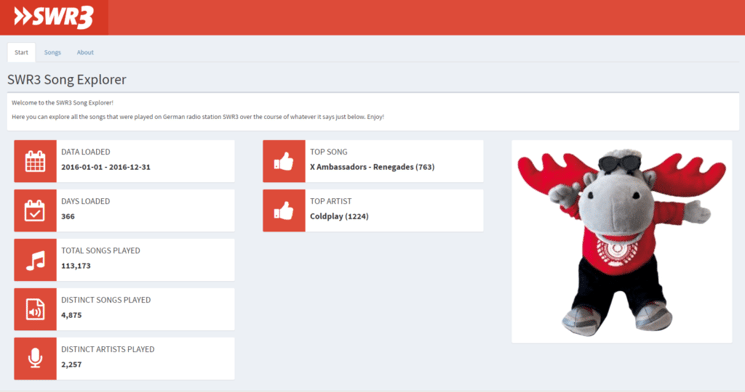
The start page of the SWR3 Song Explorer features key insights into the data such as the date range of the data loaded, how many songs were played in that range, which song and artist were played the most, etc.
It is supposed to give a quick overview about the data at hand.
Table
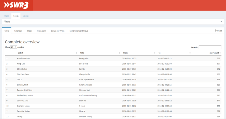
The table could be seen as the centerpiece of this application. It is sorted in descending order by play count, meaning the most played song is on top. The sorting can be changed by the user.
Next to the artist name and title of the song it also shows the first and last time the song was played on this radio station and - most importantly - how often.
This table, as well as all the other charts under Songs which are described below, can be filtered by up to 8 filters hidden in the collapsible box right above the table/chart.
Calendar
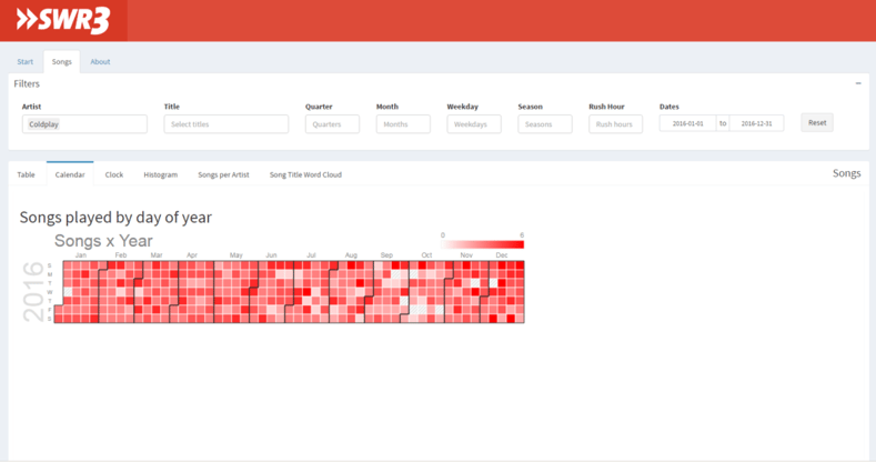
The calendar shows how many songs were played on any given day of the year. While not yielding much information when no filters are applied - basically every day the same amount of songs are played more or less - it might be interesting to take a closer look at this chart when only filtering for artists or titles.
Clock
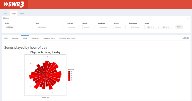
This is a rose diagram which should be read as a 24h clock. For each hour in a 24 cycle it shows how many songs were played. When not filtered by day, it shows the accumulated song count played during this hour of every day.
For this chart it is the same as for the calendar: it might be more interesting to take a closer look at this chart when only filtering for artists or titles.
Histogram
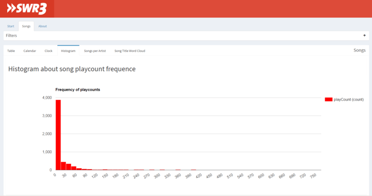
The histogram gives an interesting insight towards the distribution of songs on this radio station.
While the vast majority of songs are played between 1 and 15 times over the course of the year 2016, there are some outliers which are played much more often, up to the most played song "X Ambassadors - Renegades", being played 35 times more often than the mean (21.6) or even 318 times more often than the median (2).
Songs per Artist
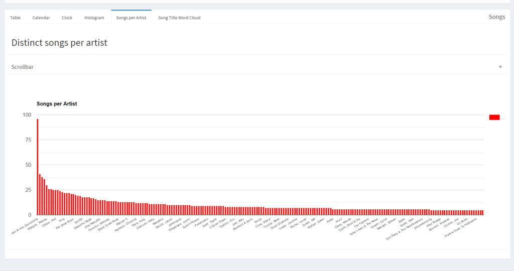
While it is interesting to learn about song statistics, taking a look at the artists might not be a bad idea.
This chart shows in decreasing order the most popular artists in terms of distinct songs played. The top artist, Bon Jovi, had 41 of their songs played, with the mean and median only being 2.3 and 1, respectively.
Song Title Word Cloud
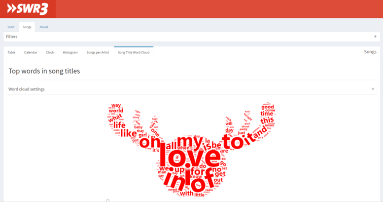
The word cloud, very fashionable in info graphics theses days, shows the most used words in song titles played on SWR3. Each song is only counted once in order to not take popularity into account.
The word cloud has two more special filters: the amount of words shown can be changed, and words to be filtered out can be specified by the user. The cloud is only updated when the apply button is pressed. Because the mascot of SWR3 is a moose, this word cloud gets generated in a moose shape when rendered for the first time. The shape can be changed to represent a circle.
Conclusion
There were some interesting findings in the data. First of all, I was amazed by the sheer amount of songs that are played during the course of one year: 113,173. Giving it a bit more thought it makes sense though: ~13 songs per hour over the course of 366 days gives a close estimate.
Also very surprising was the distribution of songs. While I had a feeling that some songs were played more than others - which was actually the main reason I analyzed the data in the first place - I was surprised that there indeed seems to be a kind of "hot rotation" going on: only 226 songs are played more than 100 times (509; 50) while the rest of the songs - 5,021 - are played less than 100 times (4,738; 50), with 1,985 of these songs only being played exactly once.
The same goes for the artists: only 68 artists have 10 or more of their songs played, the rest - 2,188 - have less than 10 of their songs played, with 1,406 artists having exactly one of their songs played.
As stated above, code and data can be found on GitHub, while the app itself is online at shinyapps.io.
Stefan Heinz
Stefan received his Bachelor's degree in Logistics from Heilbronn University in Germany, including a one year stopover in Hong Kong. He then went on to graduate cum laude from Maastricht University's School of Business and Economics in the Netherlands, receiving his Master's in Information Management. There he first got in touch with working with huge amounts of data, a thing that immediately sparked interested in him and carried over to his first position as a Business Analyst. Stefan is a savvy programmer with proficiency in SQL, VB, and PHP, to only name a few, and also a certified QlikView developer. Originally from Germany and living in Switzerland, Stefan is currently based in New York City to complete the NYC Data Science Academy Data Science Bootcamp. When not working with data he can be found binge-watching the next season of his favorite show, being on the hunt for good photos, reading a book or gaming.
View all articlesTopics from this blog: data science statistics word cloud NYC visualization python Web Scraping R Shiny Shiny Dashboard beautiful soup


