
Introduction
Music can be everywhere. When we are waking up, during in-transit, at work, and spending time with our beloved friends, music resides as an essential part of our lives. If you’ve signed up for Spotify, Apple Music, Amazon Music, Pandora, or one of the other music streaming services, you may have noticed that you’re listening to some randomly recommended songs and realize they are actually surprisingly good. These streaming services have developed numerous innovative technologies and yet stride to achieve a better solution day by day. It is obvious that each streaming services must keep on track every songs we listen to, every songs we skip, every favorites we add, but how can one streaming service outperform others without stalking each individual consumer?
Spotify’s music recommendation is often generated by the users themselves, where tracks are often populated from the curated convolution algorithms. Also there are Spotify editors who can dig into the data and determine which song will be a hit without any tangible evidence. Simply, they are the Billy Beane of the pop-music.
I wanted to do a sneak peak of how Spotify can classify and analyze music. So my web-scraping project, I'll be using Spotify's audio features metric as well as Billboard's Hot 100.
Motives
- Quantify the pop-music and explore.
- Discover a song that someone may like given the person’s favorite artist and mood with simple NLP.
- Examine if creating a playlist based on the “popular chord progression” can output a better playlist than a random shuffle. (Not completed)
The Data
To start off, what defines a “popular music” here in United States? Thankfully, we got the Billboard. The Billboard Hot 100 is the music industry standard record chart in the United States for songs, published weekly by Billboard magazine. Chart rankings are based on sales (physical and digital), radio play, and online streaming data provided by Nielsen.
Starting from August 16 of 1958, approximately total of 300,000 tracks and 28,000 unique tracks were web-scraped under 3 minutes.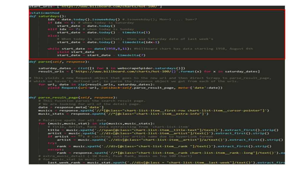 Every Billboard Hot 100 is posted on Saturdays. To enable my web-scraping scrapy code to capture every Saturdays whenever it was ran, above static method was separately initialized.
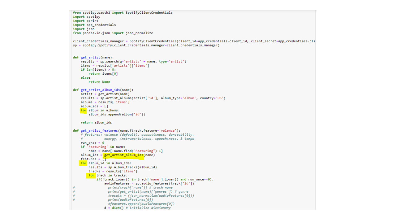
What about the metrics? We got Spotify’s awesome API service that allows the users to archive millions of songs’ audio features in JSON format. You need to create an account at developer.spotify.com. Essentially, APIs work on a request-response basis. Just for the future references, python library called Spotipy soothes up the process of retrieving data much easier.

After passing in the credentials and token information audio features can be fetched with multiple for loop calls. Lastly, by doing several feature engineering I was able to end up with 300,000 X 37 size data. You can read about audio features details here.
Before heading into analysis, “Summer is coming” and I wanted to pick out some Summer songs which appeared many times in Billboard for past 19 years.
Condition: 1) On chart more than 12 weeks, 2) count of ranked higher than the 5th 3) duration of month of June - August of each year.
Some noticeable tracks are:
- Despacito by Luis Fonsi
- Party Rock Anthem by LMFAO
- Somebody That I Used To Know by Gotye ft. Kimbra
Add them if these aren't on your summer playlist!
Analysis and Visualizations:
1. Different representation of sadness over time
“When we're feeling gloomy, many of us listen to “sad” music that counterparts our melancholy. But contrary to common assumption that sad music makes us feel sad, a new study indicates that it may actually lift our mood. In other words, sad music delivers a host of convoluted but positive emotions.” - Liila Taruffi (Lecturer in Music Psychology and Musicology in the Department of Music of Durham University)
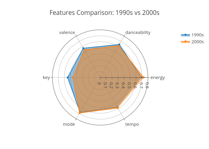
Perhaps above is a great notion why some sad music can be very popular. How does popular music define sadness in the 1990s compared to the 2000s? Will they be similar? In the world of music, emotional taste can be different by generation. For example, if I were to provide several “sad/gloomy” songs to two different groups, depending on their taste of music related to the time, one may favor the other.
Below are two distinguishable tracks that has the sad/gloomy feelings. To identify track’s emotion, Danceability, Valence, and Energy was used to plot top 10 songs of 1990-2009.
Which category do you fall under?
There isn't a significant difference between 1990s vs 2000s in terms of some the music metrics provided by Spotify except the whole step diminished key. However, with mixture feature engineered variables for plotting higher dimension of complexity in 3-D graphs, I realized more scrutinized analysis can be done.
2. Finding the happiest song that anyone may like. 🙂
Which artist?
The Beatles. Some people may disagree, but this legendary British band is considered the most favorite artist of all time. Beatles virtually hold the most number one singles in billboard charts, most consecutive weeks topping Billboard Hot 100, and considered number one artist/band in terms of the Billboard chart history.
Introducing a New Feature: Quantifying Sentiment
Natural Language Processing (NLP) is one of the most promising Machine Learning field when it comes to analyzing text for quantifying positiveness/negativeness so called polarity. Also, polarity of lyrics illustrates adequate information that correlates emotional state of a person.
To continue with the similar approach of analysis from above, the feature danceability will be replaced by lyrical polarity. From the NLTK package, PorterStemmer, stopword, and lemmatizer functions were utilized.
From the time being, I wasn't able to collect lyrics data for all. Below is small sample output from running NLP with polarity feature attached.
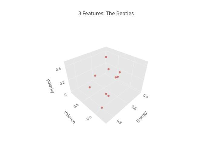
“She Loves You” is the winner! Although I have never heard of this song before, it surely brings in some happiness vibe and a lovely smile .
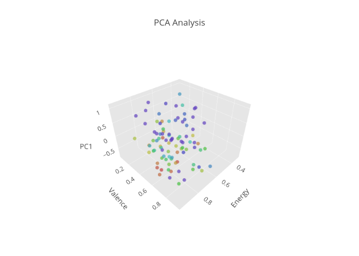
3. Strengthening 3D Visualization using PCA
Principal Component Analysis (PCA) is well known for its dimensionality reduction technique which produces a lower number of feature representation of a dataset. For the analysis, PCA is used for data pre-processing for a stronger visualization because everything becomes vague after 3 dimension.
After exploring with the Spotify audio features, I thought danceability metric lacks clear representation for how suitable a track is for dancing. To enhance this initial metric I decided to incorporate 'speechiness' and 'tempo'. PCA will basically convert a set of observations of possibly correlated variables into a a set of values of linearly uncorrelated variables.
Before running PCA, every outlier has been removed and MinMaxScaler was used for scaling. After getting one principal component from utilizing these 3 features, percentage of variance explained by component came out to be 86%. Below is plotting top 93 songs from past 9 years on the billboard chart.
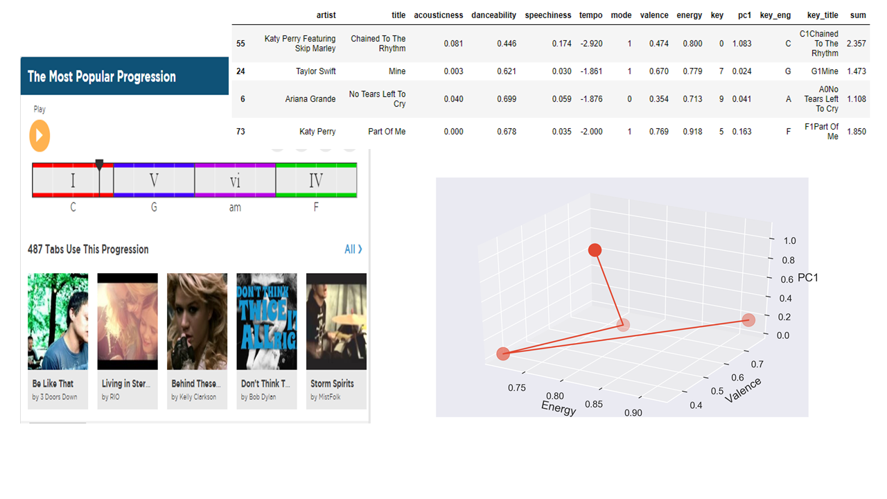
Now, I wanted to experiment if 'key' feature can be exploited as well. Key is defined as: the estimated overall key of the track. Integers map to pitches using standard Pitch Class notation. Although my knowledge of music theory is extremely limited from one class I took in high-school and only a few years of experience in the concert band, I wondered if aligning songs based on the chord progression will augment the listening experience quality over all. Above illustration is from this video: Why Chord Progression Work.
From using the I-V-vi-IV chord progression as found on the website HookTheory, a small playlist was made. My initial goal was to find the closest point from the 3-D space for each given condition for finding the right chord to create an ideal playlist rather than a random shuffle; however from its lack of time being, I'll reserve this part of work for my future experiment.
Limitations:
Nested For Loops: It took approximately 20 hours to retrieve Spotify's API JSON data from searching iteratively on each specific songs listed on the Billboard data.
Naming Convention: Track title is very different from each data sources. A lot of regex had to be utilized, yet wasn't able to fetch all the songs.
Future work:
Continue working: I did not have time to extensively code for creating an ideal playlist with given multiple combinations of the chord progressions. The only discouraging part of this work is that, there is no way for me to test if this idea will turn out to be useful. Yet, this surely was an exciting dataset to play around with.
ft. More Visualizations
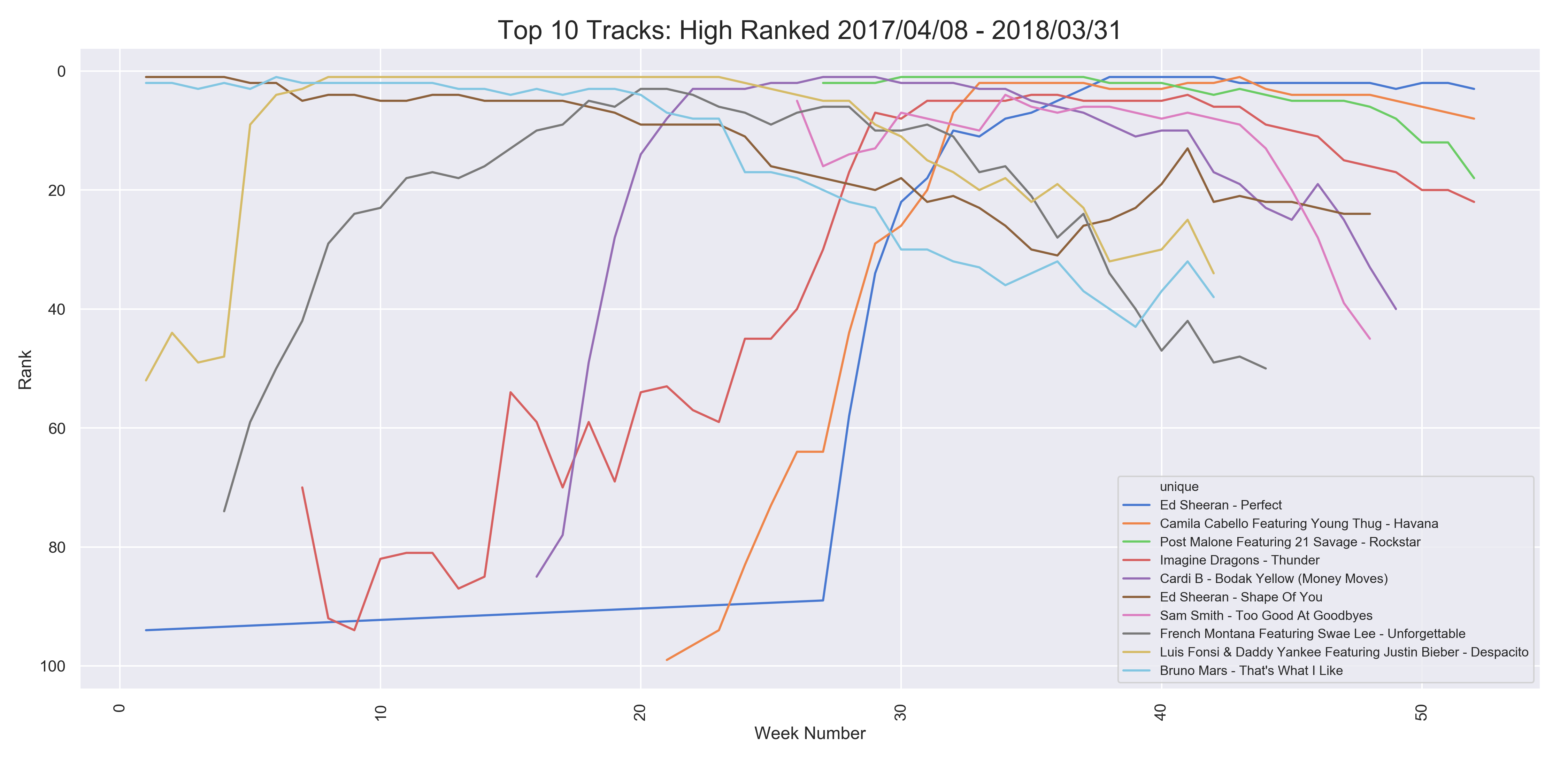
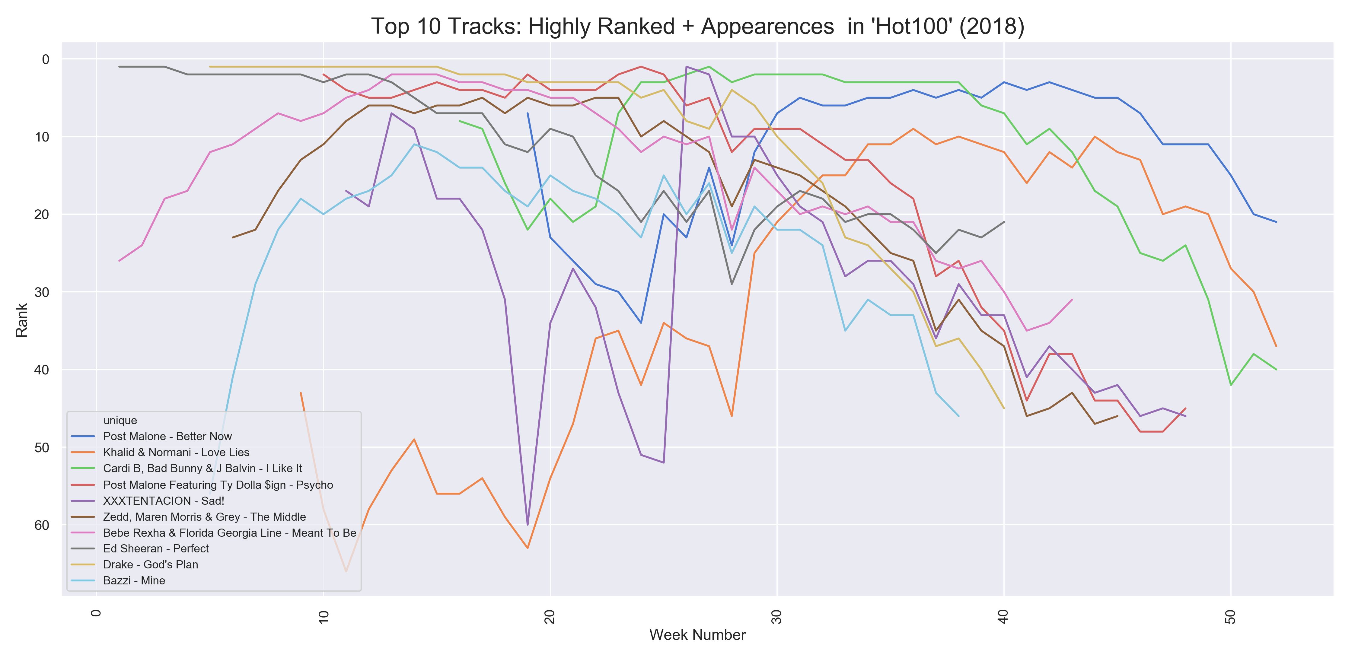
- Above two plots were to visualize the potential winners of the Billboard Artist of the Year award.
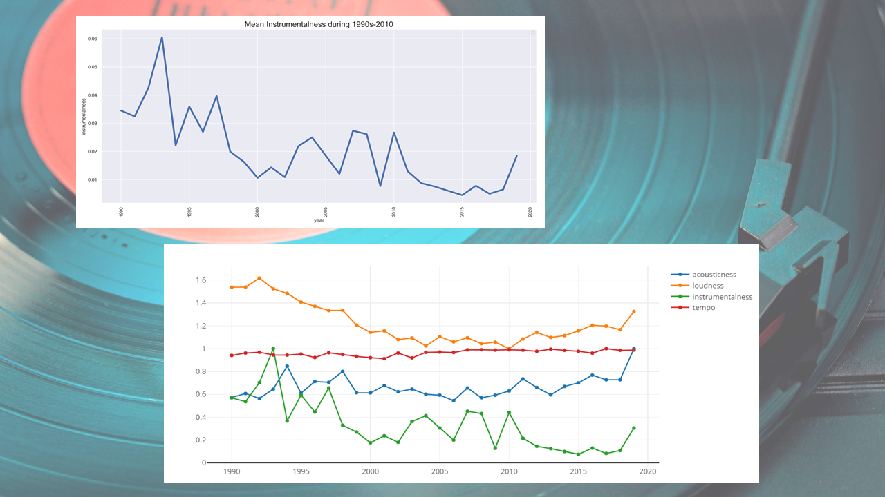
- Decrease of overall 'instrumentalness'/'loudness' of Billboard Hot 100 over the years. Highly likely due to decrease in number of bands over time.
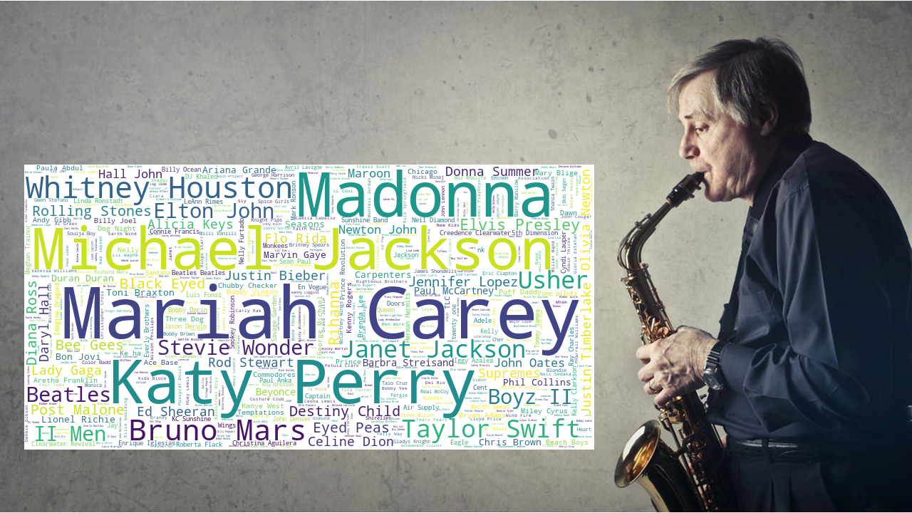
- Why Mariah Carey? Highlight below blank to see answer.
- Answer: All I Want For Christmas Is You
LAST UPDATE: 6/2/2019
Author's LinkedIn: Youngmin Paul Cho
Topics from this blog: data science API visualization python Web Scraping APIs Scrapy