NYC restaurants reviews and inspection scores
Posted by Akshay Vaghani
Updated: May 18, 2018

If you ever pass outside a restaurant in New York City, you’ll notice a prominently displayed letter grade. Since July 2010, the Health Department has required restaurants to post letter grades showing sanitary inspection results.
An A grade attests to top marks for health and safety, so you can feel secure about eating there. But you don’t necessarily know that you will enjoy the food and experience courteous service. To find that out, you’d refer to the restaurant reviews. For this project, I looked at a simple data analysis and visualization of the NYC restaurants reviews and inspection scores data to find out if there is any correlation between the two. The data will also show which types of cuisines and which NYC locations tend to attract more ratings.
Nowadays, business reviews, ratings and grades are the decision making for any business to measure for their quality, popularity and future success. For restaurants business, ratings, hygienic, and cleanliness are essential. A popular site for reviews, Yelp, offers many individual ratings for restaurants. The New York City Department of Health and Mental Hygiene (DOHMH) conducts unannounced restaurant inspections annually. They check if the food handling, food temperature, personal hygiene of workers and vermin control of the restaurants are in compliance with hygienic standards.. The scoring and grading process can be found here.
The restaurant ratings and location information used in this project come from Yelp’s API. The inspection data was downloaded from NYC open data website. I merge yelp restaurants review data and inspection data and remove NA rows which doesn’t haveeither inspection score or reviews. I also reassigned the inspection score in the grades A, B, and C category as this measure is widely used and label on restaurants. There were other scores, primarily P or Z, or some version of grade pending which we are ignoring in our analysis here. Restaurants with a score between 0 and 13 points earn an A, those with 14 to 27 points receive a B and those with 28 or more a C.
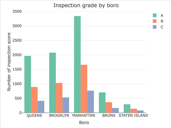
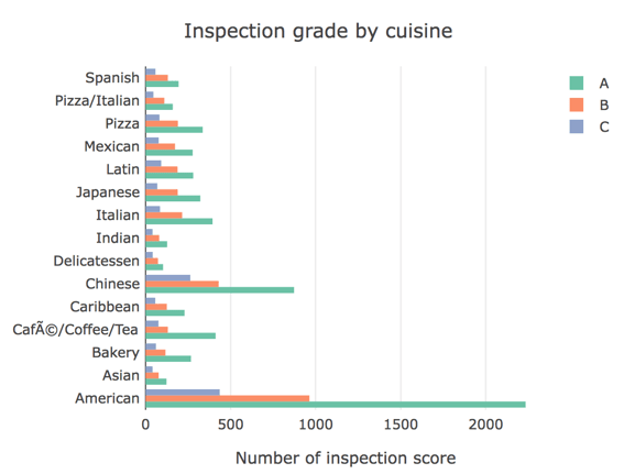
The data shows that an A is the most commonly assigned inspection grade for restaurants of all types in all locations. I plotted various bar plots to visualized the inspection scores and ratings based on borough and cuisine type.
With respect to location, this borough bar plot shows that Manhattan has highest number of restaurants with all grades compared to others. This is obvious as it has highest number of restaurants in general. Staten Island has lowest number of restaurants with grades A, B and C among all.
As for cuisine types, the cuisines plots shows first 15 restaurants with highest number of counts for based on cuisine. This indicates that the American cuisine has highest number of A grade compared to other. This indicate that american restaurants are focus more on hygienic and cleanliness compare to others type of restaurants.
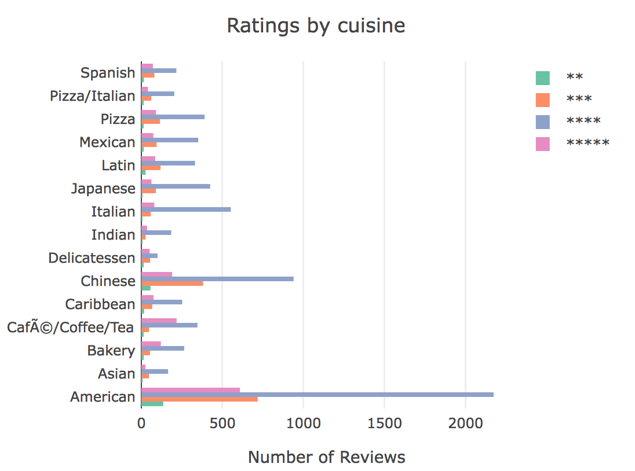
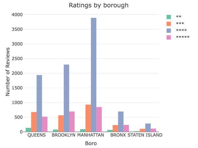
The review plot indicates that most restaurants do achieve the top rating of 4 stars. Again, Manhattan has the highest number of restaurants with ratings four stars while Staten Island has lowest numbers of restaurants with high ratings. It also shows that almost all borough have a low number of 2 star restaurants. Moreover, cuisine reviews plot indicates that American cuisine tend to have the highest rating compared to other cuisines. The reasons could be more American restaurants under this category then others.
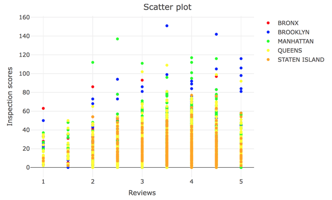
The scatter plots shows therelationship between inspection score and rating. It indicates that there is no direct clear correlation between two variables. It is fairly common for a restaurant with a C grade inspection score to achieve a 4-5 star ratings in a review. Also it is possible to find a number of A grade ratings for restaurants that only have 1-2 stars. This could be because so long as food is tasty, people will rate the restaurant well because they do not pay very much attentions to cleanliness and hygienic issues. The scatter plots also show that though some restaurants maintain a very high level of cleanliness and hygienic food conditions, they fail to get good ratings, which could be due to bad service or less than tasty food . We can do further analysis on both side of restaurants by analyzing review comments and try to find why some restaurants have good reviews but low inspection score and vice-versa. This require further data about reviews comments and further analysis using NLP.
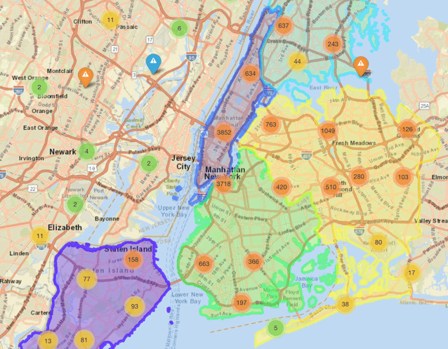
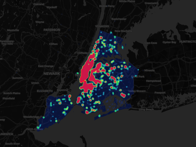
The cluster map of NYC restaurants helps visualize locations and to filter the restaurants based cuisine types. The color mark of the point indicates the ratings and includes descriptions of the featured restaurants. The heat map show the density of the restaurants based on borough selection or cuisine selection. It indicate which area has a greater number of restaurants. This could be helpful for business people to make informed decisions about where to open new restaurants based on the types of restaurants already in place.
Finally, this app can be useful for people to filter the data base on borough, cuisine , ratings , and inspection grade. The people want to go to eat with specific criteria can filters the restaurants and visit their favorite restaurants based on top marks for both ratings and inspection grades. The shiny app link is here.
Akshay Vaghani
View all articlesTopics from this blog: R NYC R Visualization visualization Student Works Shiny R Shiny yelp
