
Contributed by Christopher Redino. He is currently in the NYC Data Science Academy 12 week full time Data Science Bootcamp program taking place between January 11th to April 1st, 2016. This post is based on his first class project - R visualization (due on the 2th week of the program).
Motivation
We often hear that in many fields success isn’t based on what you know, but who you know. This is perhaps especially true in the film industry, and for young actors and film makers trying to catch a big break, the right connection can make all the difference. It’s easy enough to look up who has collaborated with whom for films on websites like IMDB, Box Office Mojo, or even just Wikipedia, but to visualize the larger network of film makers requires a little more work. Such a visualization (if it is effective) may lead to some insights into larger patterns that can inform the career decisions for aspiring film makers. One way to think of this visualization map is that it can show us how separated actors are through their collaborations. If you’ve ever played the game “six degrees of Kevin Bacon” then you may have some expectation about how dense and throughly connected this network map will be.
The Data
A first exploratory attempt at this visualization is made here with data that has been scraped from boxofficemojo.com. The scraper itself isn’t the focus of this project, but the entire source code and sample output can be found here.
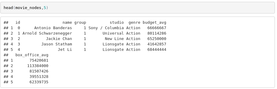
The data as scraped has one row for each movie listed on Box Office Mojo and various information about each movie. The first five rows are shown here as an example.
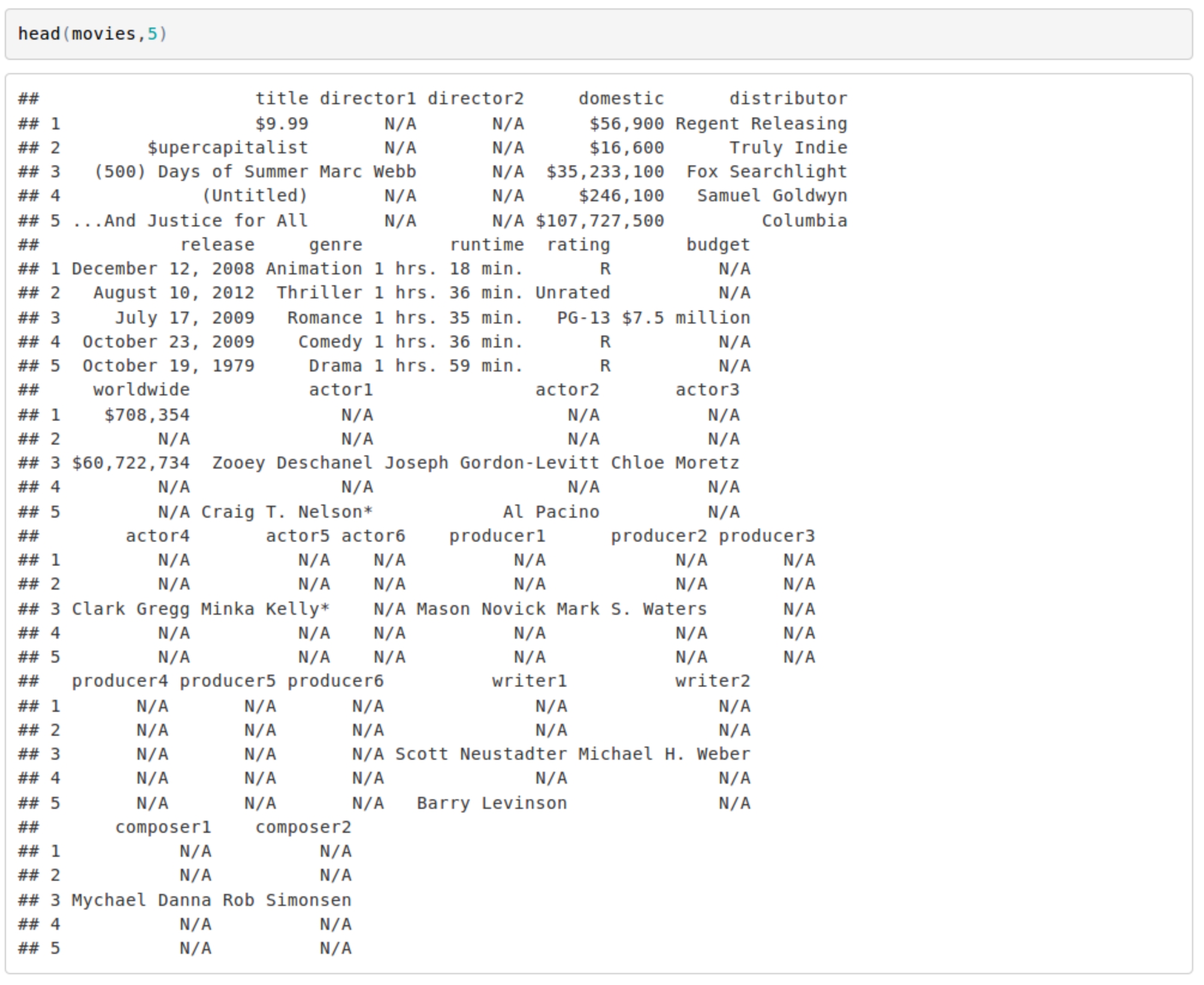
Even in just these five examples we can see the records from Box Office Mojo are very incomplete, and this will affect the accuracy/utility of the network map, but the silver lining is that the same scraper and code below can be applied later as the records are updated over time. The incompleteness of the original data (and the sub-setting of the data we will do later) may make it appear as if some rather famous actors have very few collaborators. At this time, for the quality of the data, it is not very useful for looking at individuals, but hopefully we can learn something about the larger features of the network as whole, or large subsets, such as all actors associated with a certain studio.
The data we are interested in is which actors/directors/writers etc appear with each other, and looking at the collection of all movies it seems like we already have all the information we need, but there are actually quite a few steps before we can make a network map. The first step is to decide what kinds of visualizations we intend to make, and choose the package(s) that will let us do this efficiently. There are many ways to represent a network visually, but for this first look we will use a basic network map, (and one slight variation). To do this we will actually try two separate packages, igraph and networkD3, each with their own advantages/disadvantages.

Both of these packages however are expecting the input data in a certain format. In particular, they expect a data frame listing all the “nodes” and a data frame listing all the “links”. The nodes of the network in this case are the actors and other film makers, and the node data frame will also contain any properties of the nodes we want to use to group or filter them by. The links of the network are the connections among the nodes, every incidence of one actor/film makers appearing with another is one “link”. The link data frame contains all these connections as well as any properties of the links themselves we may want to highlight in our visualization.
Most of the work that needs to be done to get to our visualizations is the reshaping, and while the highlights will be shown to follow along conceptually, there are commissions here. To reshape the data from a data frame of movies into the node and link data frames there are two more libraries that are very useful, dyplr and reshape2.

The Node Data Frame
The node frame is the easier of the two to make. Starting from the data frame with all the info for each movie, we only select out the listings of people that contributed to the film, the actors/directors/writers etc that we want to include in our map. For simplicity going forward we are only going to consider the actors with the top 6 billing spots in each movie (or less if less are listed), but the rest of the code is general enough that we can simply add back in those other people, such as writers and directors, if we so wanted with very few alterations in what follows.

We then “melt” this data frame to get one big list of people.

Besides some other steps in cleaning and indexing properly (not shown) this one melt step is most of the work for the node data frame. But with just a list of nodes our network plot may be a little boring, so we want to also add characteristics to each node, so that we may filter or group actors based on their attributes. This step involves a little more work. The characteristics we are going to consider here are the preferred genre and studio for each actor as well as their average budget and domestic box office returns on the movies they appear in. The “preferred” genre/studio here are considered to be the one that the actor/actress appears in most frequently and if there is a tie will consider the preference to be “none”. Looking at the data frame of movies we see this isn’t information that is already given to us, but it is information we can get by doing a bit more reshaping.
Node Attributes
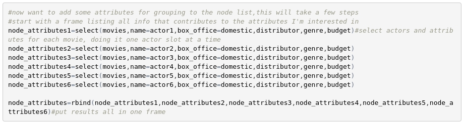
The first step to including these characteristics is to get all the data from the original movies data frame that contributes to them.
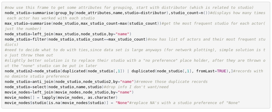
This new frame of attributes will require a few cleaning steps also (not shown). But then once we have it we can use it to calculate a new column of attributes which can then be glued onto our node data frame. As an example, the method used for getting the preferred genre is shown (including some cleaning steps), but the other characteristics are computed in a similar way.
Sub-setting Our Nodes
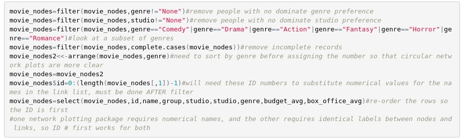
Before going on to make the link data frame, this is the right time to reduce our list of nodes if we so chose. As we will see, doing a network plot for many nodes with a very large number of links can produce a network map that is less than useful, and taking a subset based on attributes can make the results more interpretable. Now that the node data frame has attributes we can simply filter based on those attributes to get the subsets we want. The filters shown here are just one example, and at this step we have a lot of options.
We now have the node data frame completed, and we can take a look at it to review what we have done so far.
The Link Data Frame
Finally we are ready to make the other main data frame we need, the link frame. Unfortunately the structure of this frame (one row for each connection among actors) requires reshaping which is a little more complicated.
Aside from a little setup which is not shown, the main reshaping can be performed by one main function which we apply to the film maker data frame (the filtered version of the movie data frame we made early on).
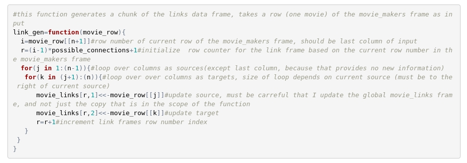
This function steps through all rows (movies) of the film makers data frame (simultaneously), and finds all connections of the first actor listed by stepping through and recording every other actor. It then steps to the 2nd actor listed and finds all of their connections in the same way (without counting those we’ve already recorded for this movie.) While there are nested for loops here for stepping through actors, it is important that the outer most layer, the part that steps through movies is NOT done as a for loop and is instead done in a way that is vectorized (simultaneous). This is because depending on how we subset our nodes we could have many thousands of movies to step through and this could cause considerable slow down if the nested for loop had to be performed thousands of times sequentially.
There are a few more steps needed to make the link data frame work properly, but this function and its application are the most important part. Before moving forward let’s see what the link data frame looks like, just so we have a better idea of whats going on.
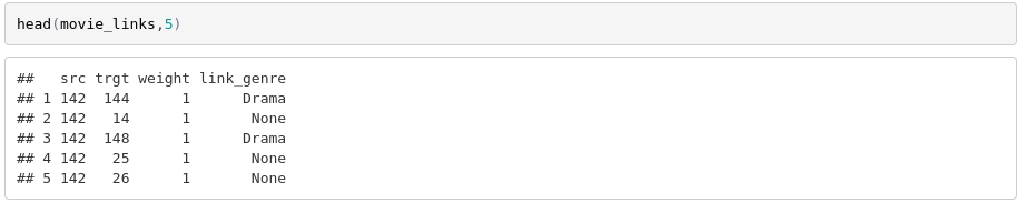
The source and target columns give the id numbers that correspond to the actors in the node data frame, the “weight” here shows how many times actors have collaborated with one another, and the link_genre indicates if the link is between actors with a common genre preference (this will be useful in a moment).
Results
For the filters applied above we’ve reduce the total number of actors to be considered but we still have hundreds of actors and thousands of connections. For our first network map we will simply try to show how all of these hundreds of actors are connected, using the networkD3 package.
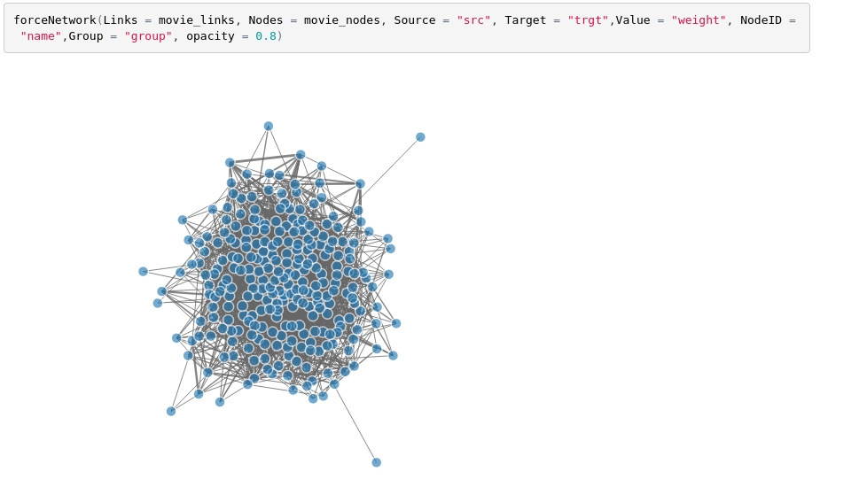
This is an example of a “force network” which is actually like a small physics simulation which tries to settle into a stable configuration to display the nodes and their links in a neat and clean matter. “Neat and clean” may be a bit of an overstatement however, as even with our filters, the hundreds of actors show so many connections that it is a bit of mess and hard to extract useful information from.
With the attributes we’ve defined for the actors we could do further filtering, and perhaps glean more information if we looked only at one studio or one genre perhaps, but instead lets try to learn something about this rather large population using the group information already encoded here. We will do the same plot again, but this time the nodes (actors) will be colored by their dominate genre.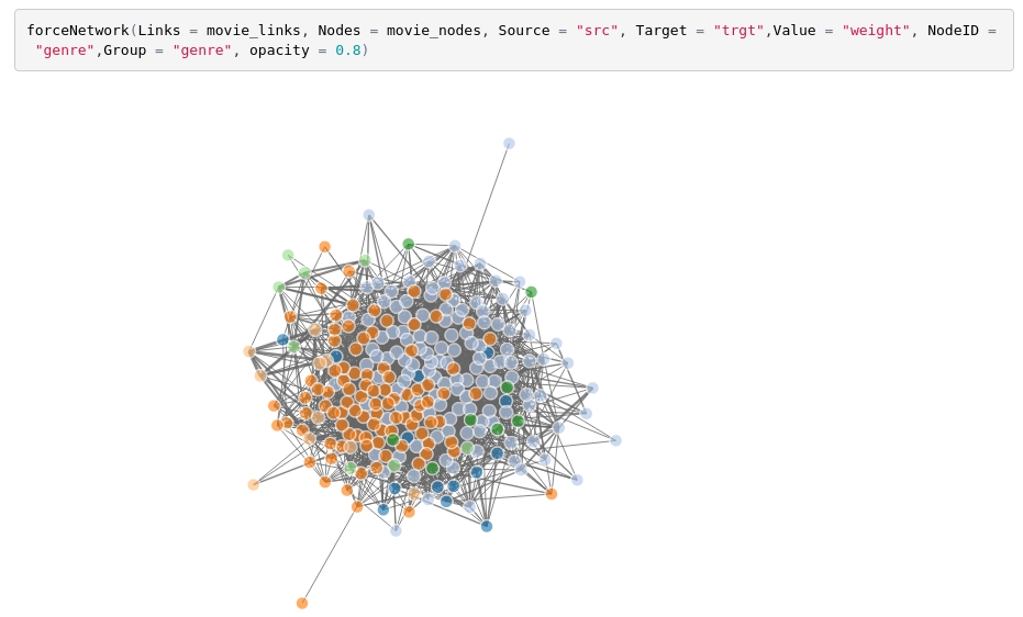
Surprisingly (at least to me, as an outsider to the film industry) we see the network split into two main hemispheres, the dominate two colors in the two hemispheres correspond to actors that favor comedy and that favor drama, with other genres like action in their own little domains, like countries with borders on a globe. There are also some genres whose actors do not stick to one territory, like the nomadic horror or romance actors/actresses.
We may still think this is an overly messy way of representing a network of this size and level of connectivity, but there are many other options for how we visualize this network. One other way which will be shown here is a a network map that instead of using “forces” to find a stable configuration, we simple force the nodes into a ring, and organize those nodes by genre. Furthermore, we can color the links between nodes if the actors sharing that link both have the same preferred genre. We will accomplish this with the igraph package. While the igraph network plots are not animated, and require us to specify a lot more parameters, they do allow for a bit more customization, which may be helpful when we are not sure at first how exactly we want to visualize a network.
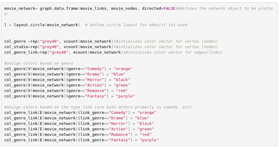
After defining our layout, and our coloring scheme we can do the plot.
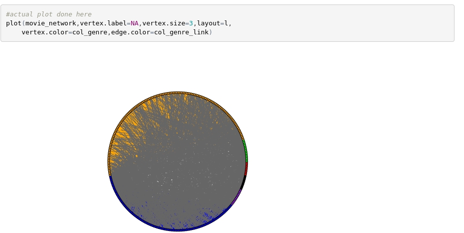
While there is a little over plotting here (gray lines with no genre being drawn over the colored lines), we can still see the same effect we noticed on the previous plot, that drama actors usually work with other drama actors, and comedy actors usually work with other comedy actors, while other genres don’t have as strong a preference.
This is just one example of the type of visualization we can make with this code, as we can change our filters and our visualization options now that we have set up the data frames correctly. With the full code we can explore more relationships within these film maker networks, like investigating to what degree different studio’s actors tend to stick to themselves, or how often actors with a history of large box office success collaborate with actors that prefer a lower budget. Furthermore, if the data becomes more complete with time (which hopefully Box Office Mojo is working on), once we see these trends and their expectations we can single out which individuals are constituting these relationships, perhaps giving a young film maker some insight into how they themselves want to try and be a part of that network.
You do often hear that it’s not what you know, it’s who you know, but with the right data and the right analysis you don’t have to make that choice between the two.
Topics from this blog: R R Visualization Student Works