
Photo credit: nkbimages vis Getty Images
Contributed by Jake Lehrhoff. Jake took NYC Data Science Academy 12 week full time Data Science Bootcamp program between Sept 23 to Dec 18, 2015. The post was based on his first class project (due the 2nd week of the program).
Background
Our world is filled with that which we choose to not see, from the rat population in New York to iTunes user agreements, all for the benefit of streamlining our own existence. A far less insubstantial marginalized aspect of society is the homeless, a population comprised of the young and old, parents and children, veterans, the mentally ill, and the unlucky.
Startlingly, estimates of mental illness in the homeless population are as high as 33%, the vast majority of which are untreated.
Research Goals
- Investigate state homeless populations
- Analyze the link between temperature and homeless populations
- Probe the relationship between mental health spending and homeless populations
Data
- 2009 Annual Homeless Assessment Report (AHAR) to Congress
- 2013 Annual Homeless Assessment Report (AHAR) to Congress
- National Alliance on Mental Health (NAMH) -- State Mental Health Cuts: The Continuing Crisis
- Average winter temperature by state
Setup and Cleaning Homeless and Mental Health Data
This AHAR and NAMH data were pulled from pdf files and converted to csv using Tabula. While this simplified extraction, the resulting data frames required much cleaning. Extra spaces, commas, and symbols had to be removed before tables could be manipulated or joined.
To simplify this process, I created a function that removes symbols from text. The function takes the character to be removed as a argument, so it can be applied to data with any unwanted character.
Additionally, using dplyr, columns were renamed, others were created, and only those relevant to the project were retained. One final piece of code removes unnecessary spaces at the end of state names. This is necessary as other tables will be joined on state names in the future, making uniformity a necessity. As we had yet to cover regular expressions in the class, more sophisticated tools for cleaning text were not applied.
as.numeric.func <- function(x, y) {
as.numeric(gsub(y,"", x))
}

homeless2009 <- read.csv("2009_homeless_estimates.csv", header = TRUE, stringsAsFactors = FALSE)

# Remove %
homeless2009$Homeless.Rate <- as.numeric.func(homeless2009$Homeless.Rate, "%")

# Remove commas, change names, create unsheltered rate, select relevant columns
homeless2009a <- data.frame(homeless2009, lapply(homeless2009[2:5], as.numeric.func, y = ",")) %>%
mutate(., Homeless2009 = Homeless.Population.1, Sheltered2009 = Sheltered.Population,
Unsheltered2009 = Unsheltered.Population.1, StatePop2009 = State.Population.1,
HomelessRate2009 = Homeless.Rate, UnshelteredRate2009 = (Unsheltered2009 / Homeless2009) * 100,
State = as.character(State)) %>%
select(., State, Homeless2009, HomelessRate2009, UnshelteredRate2009, StatePop2009)

# Remove spaces after state names
homeless2009a$State <- substr(homeless2009a$State, 1, nchar(homeless2009a$State) - 1)
A similar process was repeated for the 2013 homeless data and the mental health data, as they were all scraped with Tabula. Once cleaned, mental health data was combined with the homeless data into a single dataframe.
state_MH_budget <- read.csv("State_Mental_Health_Budget.csv", header = TRUE, stringsAsFactors = FALSE, fileEncoding = "latin1")

# Change column names
state_MH_budget <- mutate(state_MH_budget, Budget2009 = FY2009..Millions., Budget2012 = FY2012..Millions.,
BudgetPercentChange = Percent.Change) %>%
select(., State, Budget2009, Budget2012, BudgetPercentChange)

state_MH_budget$BudgetPercentChange <- as.numeric.func(state_MH_budget$BudgetPercentChange, "%")

data <- inner_join(homeless, state_MH_budget, by = "State")
Weather and Map Data
The weather data was also, unsurprisingly, messy. After cleaning, a new variable was created, Wtemp, cutting the data into three parts, "cold," "moderate," and "hot" winter temperatures. Finally, the data could be merged with map data for the upcoming visualizations.
urlWin <- "http://www.currentresults.com/Weather/US/average-state-temperatures-in-winter.php"
winterTemp <- readHTMLTable(urlWin, header = TRUE, stringsAsFactors = FALSE)

# Change names
winterTemp$`Average temperature for each state during winter.`$AvgW <-
as.numeric(winterTemp$`Average temperature for each state during winter.`$`Avg ° F`)
winterTemp$`NULL`$AvgW <- as.numeric(winterTemp$`NULL`$`Avg ° F`)

# Separate winter tables
winterTemp1a <- select(winterTemp$`Average temperature for each state during winter.`, State, AvgW)
winterTemp1b <- select(winterTemp$`NULL`, State, AvgW)

# Merge winter tables
winterTemp2 <- merge(x = winterTemp1a, y = winterTemp1b, all = TRUE)

# Merge weather with homeless and budget data
data <- merge(x = data, y = winterTemp2)

# Deciding on logical breaks for temperature factor
labels <- c("cold", "moderate", "warm")
minW <- min(data$AvgW)
maxW <- max(data$AvgW)
RangeW <- (maxW-minW)
breaksW <- c(minW, minW + RangeW/3, minW + 2 * RangeW/3, maxW)

# Adding columns with temperature groups
data$Wtemp <- cut(data$AvgW, breaks = breaksW, include.lowest = TRUE)

all_states <- map_data("state")
all_states <- filter(all_states, region!= "district of columbia")
data$region <- tolower(data$State)
Total <- merge(all_states, data, by="region")
Results
There is a lot to be discovered in homelessness data, from an understanding of where the largest populations are located to possible interactions between changing mental health budgets and changing homelessness rates.
Homelessness by State

To begin the investigation, I looked at the homeless population by state by creating a choropleth map. Without controlling for population, California would stand out as bright red, with few other states earning more than a pinkish hue. Simply stated, California's homeless population is utterly massive, over 130,000 people. A graph of homeless rate is much more effective, as it takes into account California's massive population. A look at the homeless rate by state paints a different story. California may still have a high homeless population, but it is Nevada that is the most troublesome.
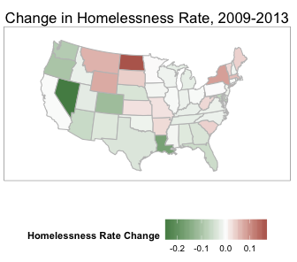 Next, let's consider how the homeless rate changed from 2009 to 2013. There are reasons to expect homeless rates to drop from 2009 to 2013: the country had time to recover from “The Great Recession” and unemployment dropped significantly. Many states see minor improvements in homeless rates, Nevada in particular. North Dakota, New York, Wyoming, and Montana show the opposite trend, with homeless rates rising .1-.2 percentage points.
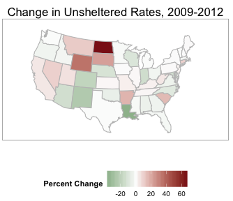
The unsheltered homeless population is the number of people sleeping on the streets on a given night, and is, at best, an estimate. However, some states saw significant shifts in the percentage of the homeless population that went unsheltered, with North Dakota’s unsheltered rate rising a troubling 60 percentage points. This aligns with reports of surging rent in light of bubbling populations, as people flood into North Dakota looking to work in the growing oil industry. Conversely, Louisiana’s unsheltered population dropped by over 20 percentage points, as more years separated the healing city from the devastation of Hurricane Katrina.
# Map of homeless population by state
map1 <- ggplot() +
geom_polygon(data=Total, aes(x=long, y=lat, group=group,
fill = Total$Homeless2009), colour="grey75") +
coord_map("polyconic") +
scale_fill_continuous(low = "white", high = "brown3", guide = "colorbar",
breaks = c(min(Total$Homeless2009), (max(Total$Homeless2009)))) +
theme_bw() +
labs(fill = "Homeless Population", title = "Homeless Population by State, 2009", x = "", y = "") +
theme(panel.grid = element_blank(),
axis.text=element_blank(),
axis.ticks=element_blank(),
title=element_text(size=14),
legend.text = element_text(size=10),
legend.position = "bottom")
map1
Weather and Homelessness
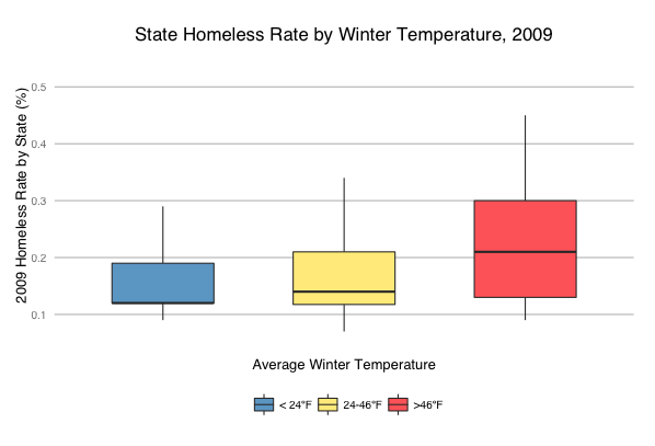
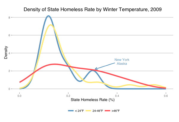
It comes as no surprise that there are more homeless people in warmer climates. However, more interesting than the homeless population is the homelessness rate. This data can be visualized multiple ways. On the left, we have a boxplot showing the homeless rate by temperature group. As expected, warmer states have higher homeless rates while cold states have the lowest. When plotting homeless population instead of rates, New York appears as an outlier for cold states and California for warm states--more evidence that normalizing for population is an absolute necessity.
The density plot on the right depicts that cold and moderate temperature states have similar distributions of homeless rates, while warm states have a greater distribution of rates. New York and Alaska stick out as having discernibly higher homeless rates than other cold weather states, skewing the distribution to the right.
# Boxplot of homeless population and winter temperature
bp1 <- ggplot(data, aes(Wtemp, Homeless2009, fill = Wtemp)) +
theme_hc() +
geom_boxplot(outlier.colour = NA, width = .75) +
scale_y_continuous(limits = c(0, 150000)) +
geom_text(aes(label=ifelse((Homeless2009>5*IQR(Homeless2009)),State,""))) +
scale_fill_manual(values = c("skyblue3", "lightgoldenrod1","indianred1"),
name="",
labels = c("< 24ºF", "24-46ºF", ">46ºF")) +
xlab("Average Winter Temperature") +
ylab("2009 Homeless Population by State") +
ggtitle("State Homeless Population by Winter Temperature, 2009") +
theme(legend.position = "bottom",
axis.text.x = element_blank(),
axis.text.y = element_text(size=10),
axis.ticks = element_blank(),
axis.title=element_text(size=12),
title=element_text(size=14),
legend.text = element_text(size=10))
bp1

# Density plot of homeless rates
l1 <- ggplot(data, aes(HomelessRate2009, color = Wtemp)) +
geom_line(stat = "density", size = 2) +
scale_color_manual(values = c("skyblue3", "lightgoldenrod1","indianred1"),
name="",
labels = c("< 24ºF", "24-46ºF", ">46ºF")) +
scale_x_continuous(limits = c(0, 0.6)) +
xlab("State Homeless Rate (%)") +
ylab("Density") +
ggtitle("Density of State Homeless Rate by Winter Temperature, 2009") +
annotate("text", x = .42, y = 2.85, label = "Alaska", size = 4, color = "skyblue3", face = "bold") +
annotate("text", x = .42, y = 3.3, label = "New York", size = 4, color = "skyblue3", face = "bold") +
geom_segment(aes(x = .39, y = 2.9, xend = .31, yend = 2.2), arrow = arrow(length = unit(0.3, "cm")),
color = "skyblue3") +
theme_hc() +
theme(legend.position = "bottom",
axis.text=element_text(size=9),
axis.title=element_text(size=13),
title=element_text(size=14),
legend.text = element_text(size=10))
l1
State Mental Health Budgets
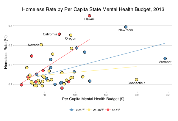
Given the prevalence of mental illness in the homeless population, homeless rates were plotted against mental health spending, with linear regression lines included for reference. The plot above highlights a few states whose homeless rates are particularly interesting, given their mental health budgets. Of course, there are far more elements affecting homeless rates than a state's mental health budget, but it is interesting to see that Nevada has both one of the lowest budgets and one of the highest homeless rates, while Connecticut, on the other hand, has the second highest budget and one of the lowest rates. Furthermore, New York invests heavily in mental health but still hold the second highest homeless rate. Statistical analyses are necessary to understand the strength of these relationships, but such correlations are beyond the purview of this study.
p1 <- ggplot(data, aes(Budget2012/StatePop2013*1e6, HomelessRate2013)) +
geom_point(size = 5) +
geom_point(aes(col = Wtemp), size = 4) +
scale_color_manual(values = c("skyblue3", "lightgoldenrod1","indianred1"),
name="",
labels = c("< 24ºF", "24-46ºF", ">46ºF")) +
theme_hc() +
ylab("Homeless Rate (%)") +
xlab("Per Capita Mental Health Budget ($)") +
ggtitle("Homeless Rate by Per Capita State Mental Health Budget, 2013") +
geom_text(aes(label=ifelse(HomelessRate2013>.4 | Budget2012/StatePop2013*1e6 > 150, State,""),
vjust = 1.75), size = 4) +
geom_text(aes(label=ifelse(HomelessRate2013>.3 & Budget2012/StatePop2013*1e6 < 80, State,""),
hjust = 1.15), size = 4) +
geom_text(aes(label=ifelse(HomelessRate2013>.35 & HomelessRate2013<.356, State,""),
vjust = 1.75), size = 4) +
geom_smooth(method=lm, se=FALSE, aes(color = Wtemp)) +
theme(legend.position = "bottom",
axis.text=element_text(size=9),
axis.title=element_text(size=13),
title=element_text(size=14),
legend.text = element_text(size=10))
p1
Changes in Mental Health Spending
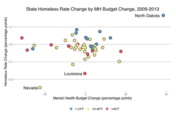 Changes in mental health spending and homeless rates from 2009 to 2013 show modest changes in homeless rates. Despite huge increases in menthal health spending, North Dakota's homeless rates continue to rise. Nevada, on the other hand, decreased it's spending and yet saw a reduction in homeless rates. Unfortunately, more current data show that that trend didn't last. Louisiana also saw a decrease in homeless rates with virtually no budgetary change, again, likely due to other services aimed to support those affected by Hurricane Katrina.
p3 <- ggplot(data, aes(BudgetPercentChange, HomelessRate2013-HomelessRate2009)) +
geom_point(size = 5) +
geom_point(aes(col = Wtemp), size = 4) +
scale_color_manual(values = c("skyblue3", "lightgoldenrod1","indianred1"),
name="",
labels = c("< 24ºF", "24-46ºF", ">46ºF")) +
theme_hc() +
ylab("Homeless Rate Change (percentage points)") +
xlab("Mental Health Budget Change (percentage points)") +
ggtitle("State Homeless Rate Change by MH Budget Change, 2009-2013") +
geom_text(aes(label=ifelse(HomelessRate2013-HomelessRate2009 >.1 |
HomelessRate2013-HomelessRate2009 < -.15, State,""),
hjust = 1.15), size = 5) +
theme(legend.position = "bottom",
axis.text=element_text(size=9),
axis.title=element_text(size=12),
title=element_text(size=13),
legend.text = element_text(size=10))
p3
Conclusions
Beyond the expected relationship between temperature and homeless rates, this investigation uncovered some interesting relationships between state mental health budgets and homeless rates. For one, North Dakota's significant increase in mental health budget may be better understood in light of the increase in homeless rates, and in particular, unsheltered homeless rates. Nevada's decrease in mental health spending, possibly in light of it's decreasing homeless populations, may have set the scene for the subsequent increase in homelessness in the years following this data. Finally, the decrease in homelessness in Louisiana is due to improvements in other welfare supports beyond mental health care.
For more on mental illness and homelessness, these worthy organizations have lots of great information and prominently placed donate buttons, if you feel so inclined.
Topics from this blog: R R Visualization Student Works