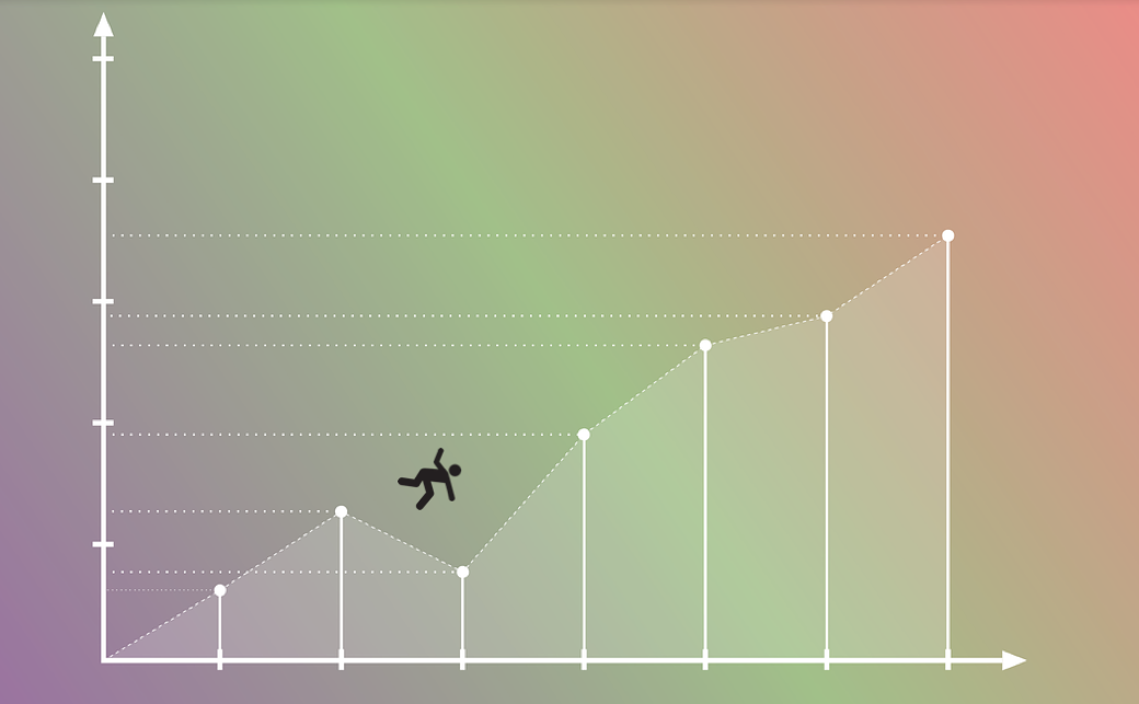
Robert Frost, one of the great American poets of the early twentieth century, once stated, "In three words I can sum up everything I've learned about life: it goes on." If we can take his observation and apply it to the average life expectancy of humans across the globe as a single group, we can say that life not only goes on, but, fortunately, also up. (see graph below)

World Average Life Expectancy
But, alas, the devil is always in the details. That is where this first Shiny data science project leads me: an exploration into the not so rosy life expectancy data around the world.
The Data
Although there are numerous open data sets around the web, one of my favorites is The World Bank. Specifically for this endeavor, the HealthStats portal published via the World Bank Group. The data set provides female and male life expectancy information for 253 countries and covers a time range from 1960 through 2014. It's a substantial collection of data for my initial inquiries.
Here We Go
Every investigations needs at least one tool. Here we leverage Shiny to dive past the very general trend line of a global population and graph separate gender box plots of all countries to see if anything stands out.
Looking at the plots, it becomes immediately obvious that although the median trend of countries is positive, we have some serious outliers in the data. Overlaying the gender differences provides extra contrast.
Why Did The Floor Drop Out?
The outliers show a significant drop in life expectancy. So what countries are causing these? Ideally, the Min/Max selection would already identify the data points and display them below the plot. It's a feature still in work, so we can make use of the tab panel that displays the raw data set.
If we note the years of interest below the outliers from the box plot, we can locate the equivalent year/column in the data set. Sorting the year column in ascending order allows us to identify the countries with the minimal life expectancy numbers. Filtering individually on the top five countries in the primary plot reveals the devil within the details.
Cambodia
After searching the affected years in Cambodia, we find the following significant events: Cambodian Civil War (1970-1975), Khmer Rouge regime (1975-1979). The later event was well known as the "Khmer Rouge Killing Fields". 1 million+ people were killed during this period.
Sierra Leone
Here we have the Sierra Leone Civil War (1991-2002) with 50K+ people killed. This is one of the countries of the "Blood Diamond" infamy.
Rwanda
Rwanda was cursed with a civil war (1990-1994) that quickly became genocide (~1994). It was estimated that 800K+ people were killed in 100 days.
Zimbabwe
Zimbabwe primarily suffered from a devastated economy and massive food production shortages due to government actions during the affected years.
Swaziland
Health issues seem to be the main culprit affecting Swaziland. Tuberculosis, with HIV/AIDS being especially devastating (WHO data in 2002 shows that 64% of all deaths in the country were caused by this illness), contributed the lion share to mortality statistics.
Where To Next
An initial glimpse deeper into the data shows some periods of painful rot beneath the healthy global trend concerning life expectancy. Continued enhancement in the Shiny app will provide more efficient insights into the what/when/how of country data points. The following modifications should help with that goal:
- Integrate other health/cause-of-death/disease data sets
- Integrate war/conflict data sets
- Global maps for country selection/visualization
- Fractal plot layouts: The graphs used show noticeable differences in gender life expectancy depending if primary causes were conflict versus health/hunger. Those insights are easier to see when plots are positioned next to each other.
Topics from this blog: statistics R NYC visualization Student Works Shiny