This project aims to (1) visualize the patterns of NYC 2017 house sales in each of the five boroughs, (2) put forth some preliminary postulates to explain the patterns. I focused on the patterns of transaction volumes (i.e., how many houses sold) and house prices, with respect to location and time. I chose this topic because the scope is focused and the data set is relatively clean. Also, there was a personal reason: I bought a house last year (2017) in Staten Island. After going through the whole process (looking for a house in the right location, putting in bids, applying for the mortgage, and finally closing the deal), I became interested in learning NYC's real estate patterns since then. I feel maybe I can talk about something specific and interesting to house sellers/buyers.
1. Data Source and Pre-Processing
The raw data set is NYC Department of Finance's 2017 property sales records (locations/building years/square-footages/sales dates/prices/etc.). It consists of five files corresponding to the five boroughs of NYC: Manhattan, Bronx, Brooklyn, Queens and Staten Island. For raw data, see
http://www1.nyc.gov/site/finance/taxes/property-rolling-sales-data.page
To simplify analysis, we concentrated on two quantities: transaction volumes (henceforth shortened as "volume") and prices, with all other information (such as buildings' ages, square-footages, etc.) not considered. Also, for practical consideration, all transaction records with dollar amount less than $100,000 were filtered out for this project. Finally, analysis for each borough is based on the study of all zip-code areas in each one.
Some summary results appear in the following graph. Left: transaction volumes by borough; Right: median house prices by borough.

2. Data Transformation: Borough-wise Normalization
We now move to the next level, to find more interesting or fundamental patterns. But before that, we perform such data transformation: Borough-wise Normalization. It is a term coined by the author of this project, and is no different than the usual normalization in statistics (i.e. calculating z-scores). We spell out its context (i.e., borough-wise) to remind how the normalization should be done. Say we want to normalize a particular zip-code area's January house sales volume, and say the zip code is 10305 ∈ Staten Island, we normalize it with respect to the average level μ and standard deviation σ of house sales volume in Staten Island in January. Note that we normalize with appropriate borough-wise values. Similarly, we normalize house prices borough-wise. Further data visualization and analysis are based on the borough-wise normalized volumes and prices. For more algorithm-like description (so that interested readers can implement them with programs), see the following linked notes which I wrote for this project:
https://github.com/jamesczq/ShinyApp_NYC_17_House_Sales/blob/master/jamesczq_proj1.pdf
Why do we want such normalizations? The reason is both practical and philosophical. Practically, it makes the pattern sharper (hence easier to identify a pattern). Philosophically, as everything is relative, we need to put a quantity in a most appropriate context. When you claim that a certain zip-code area (e.g. 10305 ∈ Staten Island) appears active in terms of house sales volume, you claim so not because you compared it with other boroughs but with the relevant borough-wise average (Staten Island in this case). When you claim a zip-code area (e.g. 11234 ∈ Brooklyn) appears to be competitive in terms of house prices, you didn't compare it with Manhattan's price level but with the relevant borough-wise average (Brooklyn in this case).
Below are two visualization examples that use heat maps to show the transaction activity patterns; the heat intensity is set to be proportional to normalized house sales volumes. The heat dots are plotted per zip-code in a borough. The more intense a red dot, the more transactions occurred in that zip-code. Please note that a zero heat-intensity does NOT mean no house sold in that zip-code; it just means the volume sold there was at the borough’s average level (recall that we are plotting the normalized volumes, not the volumes themselves). Likewise, a green dot indicates a zip-code area has below-average house sales volume.
Example 1. Transaction Activity Pattern in Queens: May versus June, 2017.
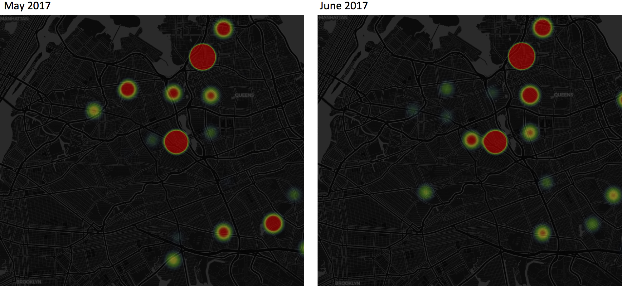
In this example, some of the most eye-catching patterns include: (1) In both May and June 2017, there is a dominant red dot (highly active in transactions) in the neighborhood of Flushing, Queens, where MTA 7-Trains end and the largest Asian populations in NYC reside. (2) In May, a constellation of red dots led from Flushing to Elmhurst, Queens, each of which corresponds to a major 7-Train stop; however, those red dots became green (below-average) in June. (3) The opposite process occurred in the neighborhood to the west of Forest Hills and to the east of Meadow/Willow Lakes: both changed from green to red from May to June.
The above observations may or may not be surprising depending on an observer’s familiarity with Queens’ housing market. You can explore the Shiny App I developed to discover “surprising” findings by playing with Month and Borough choices. The Shiny App can be accessed by the following link:
https://jamesczq.shinyapps.io/NYC_House_Sales_2017/
The potential business point is that identifying this activity pattern may be useful for buyers or sellers or real estate developers. For example, assuming this kind of pattern will be the same in 2018, if I anticipate buying a house in between Flushing and Elmhurst and hope to get the business done around May, I could expect more transactions in May and less in June. Sound business decision may be further made. For example, buyers may think about should they avoid high activity time so that they will not have to compete with other bidding buyers and pay more than a house's actual value.
Example 2. Transaction Activity Pattern in Staten Island: July versus December, 2017.
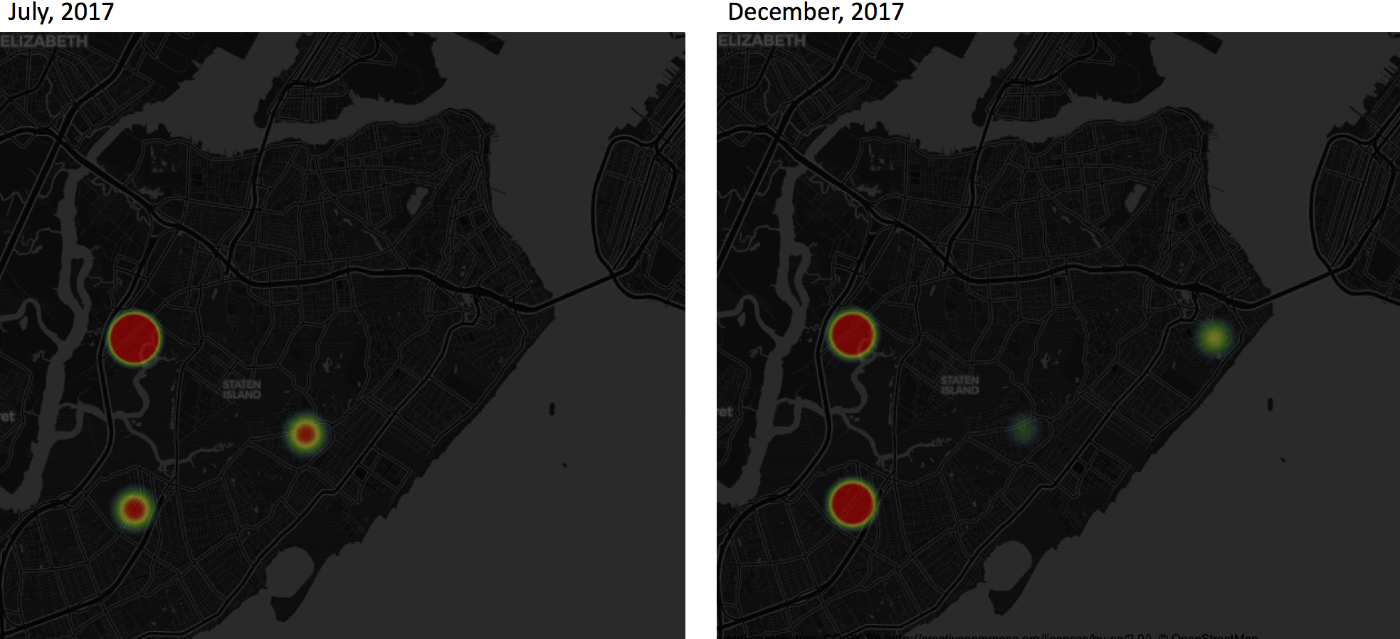
As a resident of Staten Island, I find the patterns in this example make a lot sense. (1) Notice the neighborhood right near the Verrazano bridge (the Arrochar neighborhood, east end of Island and at the last exit of cross-Island highway I-278), which appears to have at- or below-average transaction volumes. That's where my house is, so I can confirm that nearly no one in this neighborhood was selling properties. To use this information to make better business decisions, you would want to first answer the question: is property investment in a low-transaction neighborhood wise or not? As for most things, that depends. If such a neighborhood experiences low sales volume due to, say, high crime rate, it is wiser not to invest there. But a low transaction volume could also be a sign that not many residents want to sell because they're happy in the neighborhood. In such cases, whenever you have the opportunity to buy in at a reasonable price, you probably should do so. (2) You can clearly see the neighborhood in the Island’s belly (the New Dorp neighborhood) changed from red-hot to green-cool from mid-year to year-end. The reason is this: One of the best high schools in Staten Island is in that neighborhood. At the end of spring semesters (from May to July), families move in and out which is typical at the end of an academic year; but such activity is muted at the end of fall semesters (winter time). Say if you want to invest in properties in New Dorp and you are in no hurry, it is more advisable to buy in during winter than spring, since you may compete with more bidding buyers in the spring but less so in the winter. On the other hand, if you are house sellers, it may be more profitable to sell properties in spring.
Now that I am an Islander so I know local things. But for an outside investors (from Brooklyn, Long Island, or even further) who may not be familiar with Island affairs and who may not have time/energy to travel here to survey, this transaction activity pattern can provide valuable intelligence to help make sound business decisions.
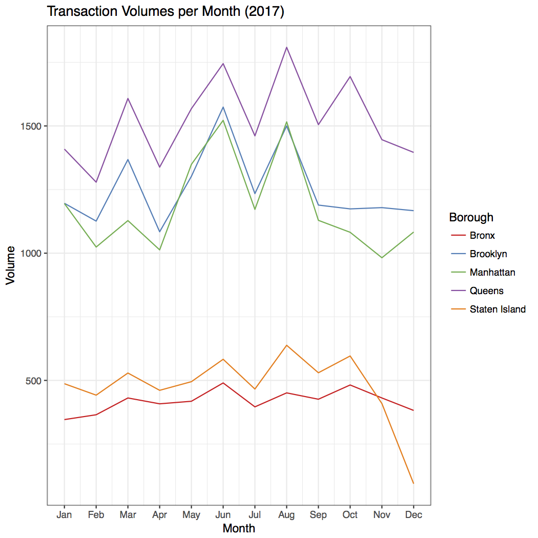
3. Further Observations Part I: Overall Time Behavior of Transaction Volumes
It is a little surprising to find there seems to be a periodic oscillation in transaction volumes for each borough, and the oscillations occur with the same frequency. See the following plot:
To go beyond visual inspection, we can look at the Fourier transform of the data (or equivalently the time-autocorrelation). A preliminary result looks like the following plot, which suggests some periodicity exists.
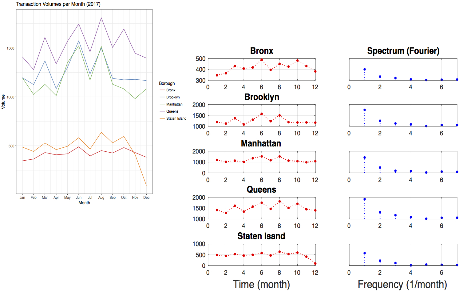
But I have to say the conclusion is not robust yet. First, I have not carefully conducted the discrete Fourier transform. For example, the discrete Fourier transform was done with Fast Fourier Transform (FFT). But how many points in the FFT should I use, given 12 data points in time to be certain, so that I am not over-sampling or under-sampling? Second, a more rigorous examination of periodicity should take into account more data in time, say, data merged from 2016, 2015, etc.
4. Further Observations Part II: Overall Spatial Behavior of House Prices
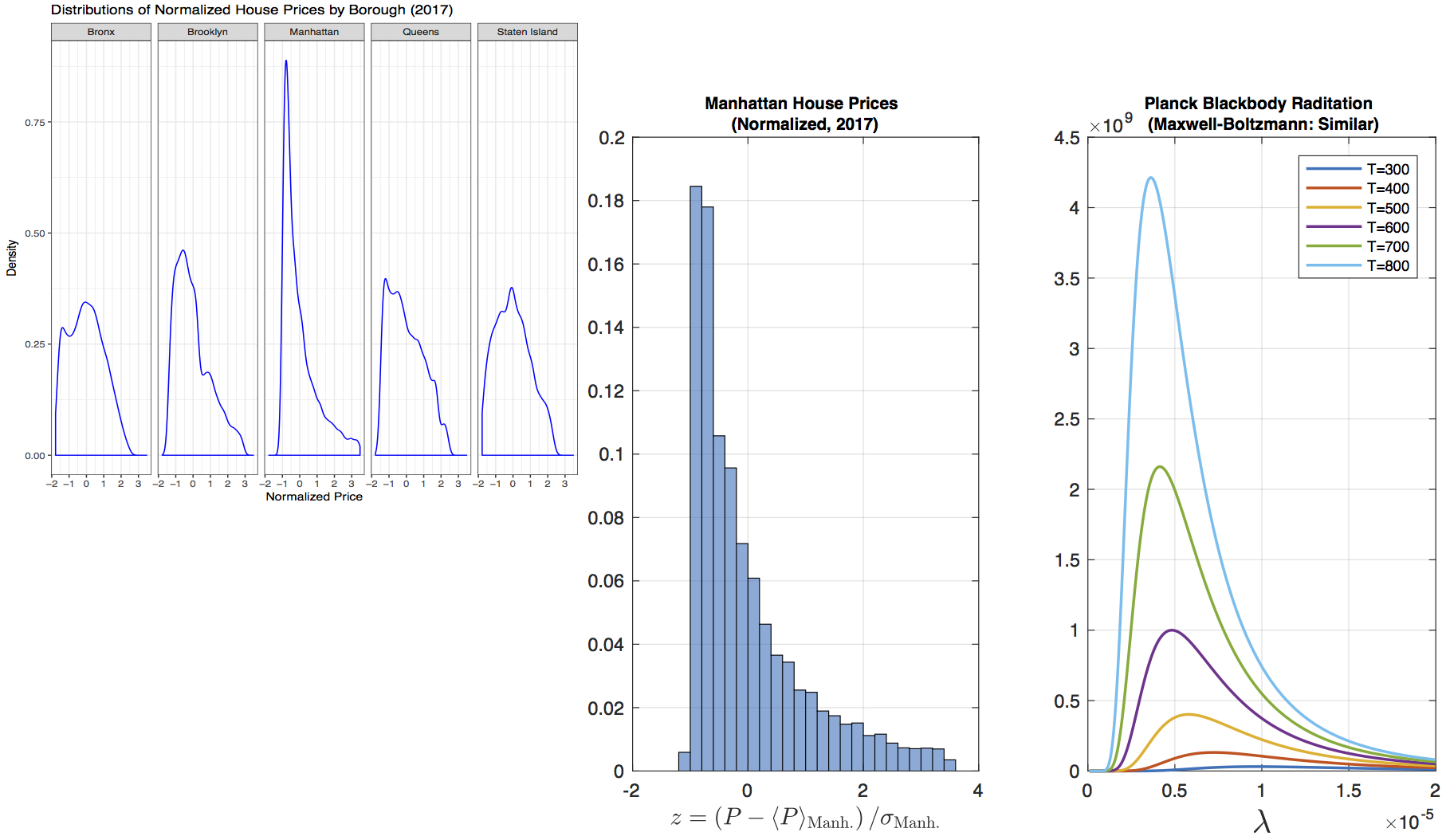
So far, we have not discussed about the house prices yet. Now let us examine the prices. Below are density plots of the distributions of the normalized prices in five boroughs, aggregated over 2017.
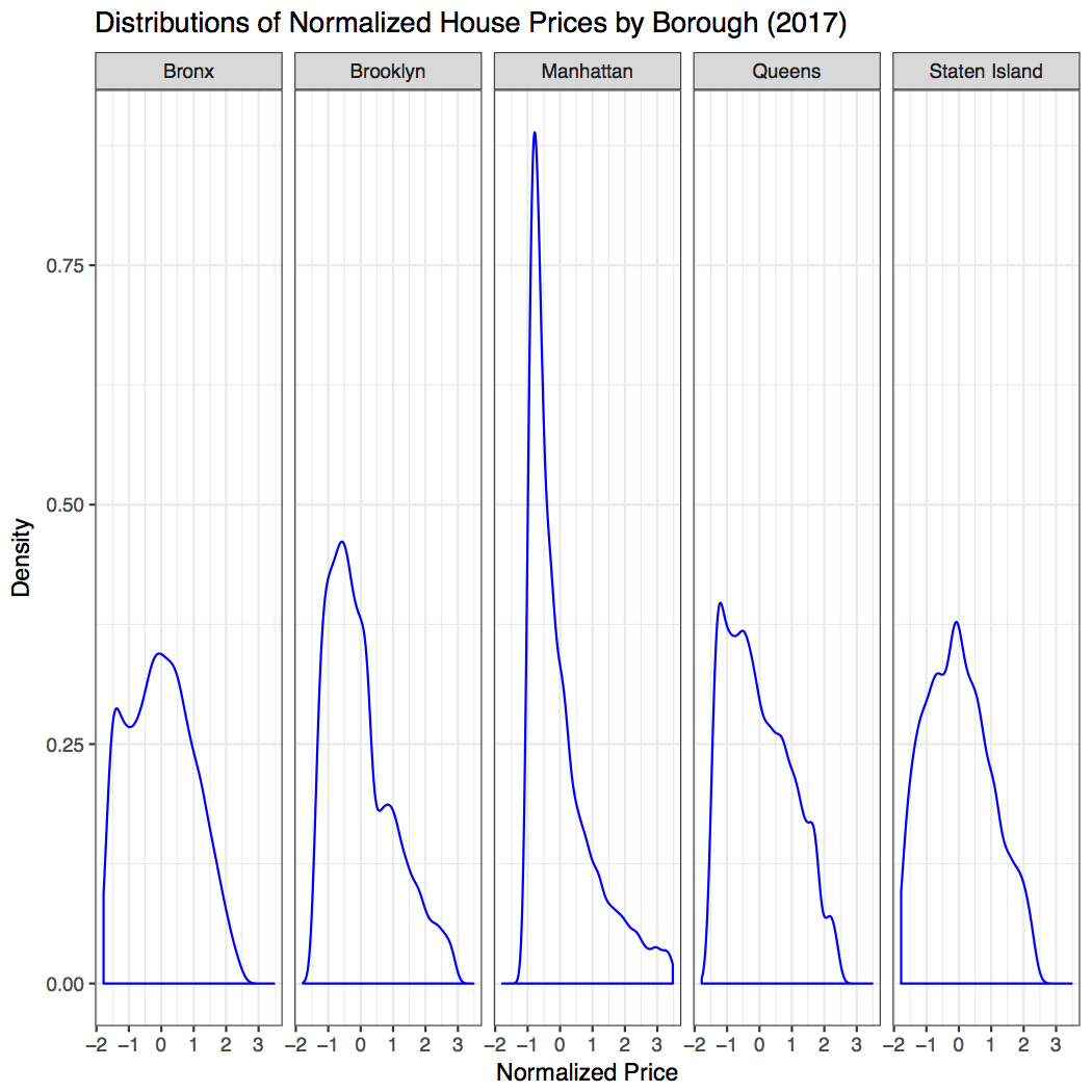
Actually, the more in-depth thought of this project stems from observing the above distributions. Let me save a long-winded description, but directly point out to the following observation. The five distributions seem to come from the same family of a particular kind, such that it grows at the beginning like a polynomial (linearly, quadratically, etc.) but then after certain point decays at least exponentially. In thermodynamics, we see this kind of behaviors from the Maxwell-Boltzmann distribution for velocities of ideal gases, or the Planck’s blackbody radiation law relating radiation power density (per wavelength) to wavelength (essentially 1/momentum of photons) of “gases” of photons. The real power is that even though those models only take one underlying parameter, that is, temperature (no one hundred features!), they can make predictions about macroscopic properties associated with seemingly complicated random motions very well. We always desire models that work well and are simple enough but not simpler.
The following plot illustrates the analogy between distributions of normalized house prices at different locations (different boroughs) and distributions of radiation power densities at different temperatures. For clarity, we only plot Manhattan’s price distribution to compare with the radiation power density distributions. It is clear that the role played by location in determining price distributions parallels the role played by temperature in determining radiation power density distributions. This confirms an old saying about the three things that matter most in real estate business are “location, location, location.” In this preliminary examination, we had not fitted the price distribution curves with the functional form taken by radiation power density distributions. But that is not difficult to do should we choose to do it, since we now know exactly what functional form we want to fit.
We further postulate the following correspondence relations between real estate business and thermodynamics. Since not everyone is familiar with thermodynamics, we will save the technical definitions.
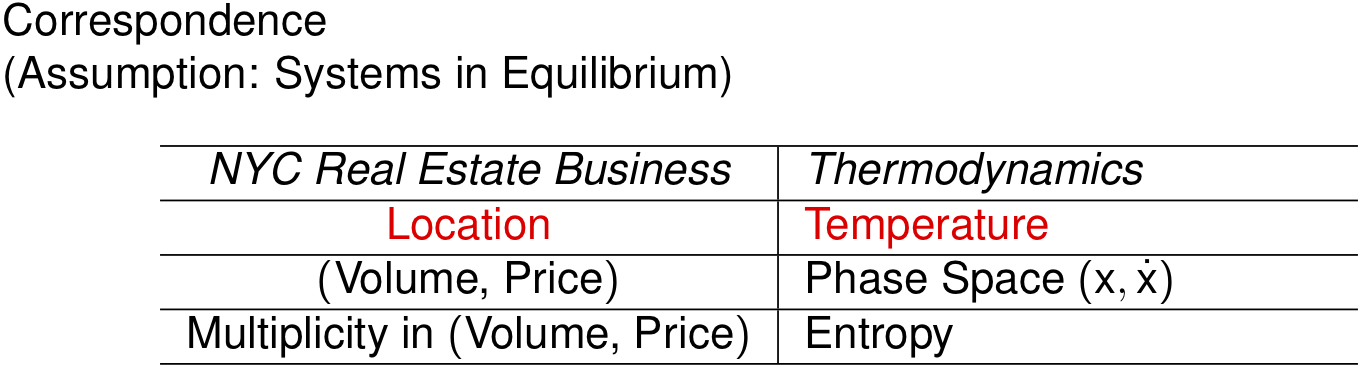
Please note that correspondence is by no means equality! The correspondence relations just suggest what analogies can be drawn. (In fact, I suspect that price is technically analogous to 1/momentum, instead of momentum.)
If we can quantify temperature and entropy in real estate business, we may further quantify quantities such as free energy (maximum useful work a system can do under certain constraints), chemical potentials (“energy” introduced per transaction, which may tell how transaction volumes influence price distribution), etc. Those may help understand the mechanism of real estate business better with a theoretical framework from thermodynamics to guide our thinking. One more point: if the price distributions behave closely in the style of blackbody radiation or Maxwell-Boltzmann distribution, we should be happy, since it indicates that prices are determined by a free market. Why? If we go back to the original derivation of Planck's blackbody radiation law or Maxwell-Boltzmann distribution, be it gases of photons or ideal gases, the assumption is that the only interaction between particles is elastic collision and there is no other kind of interaction or external forcing. If there is some other kind of interaction or external forcing, the radiation will not be blackbody-like, nor will the velocities be distributed Maxwell-Boltzmann like. Therefore, analogously, if the house price “radiation” is Planck-like or Maxwell-Boltzmann like, it implies the underlying microscopic bidding/buying activities are elastic “collisions.” That means that we'd see no loss of overall momenta\um after “collision” (bidding/buying) and no other kinds of interaction or outside forcing (large-scale organized speculations or price controlling, say). It provides some metric to monitor the healthiness of house market.
Ending remarks:
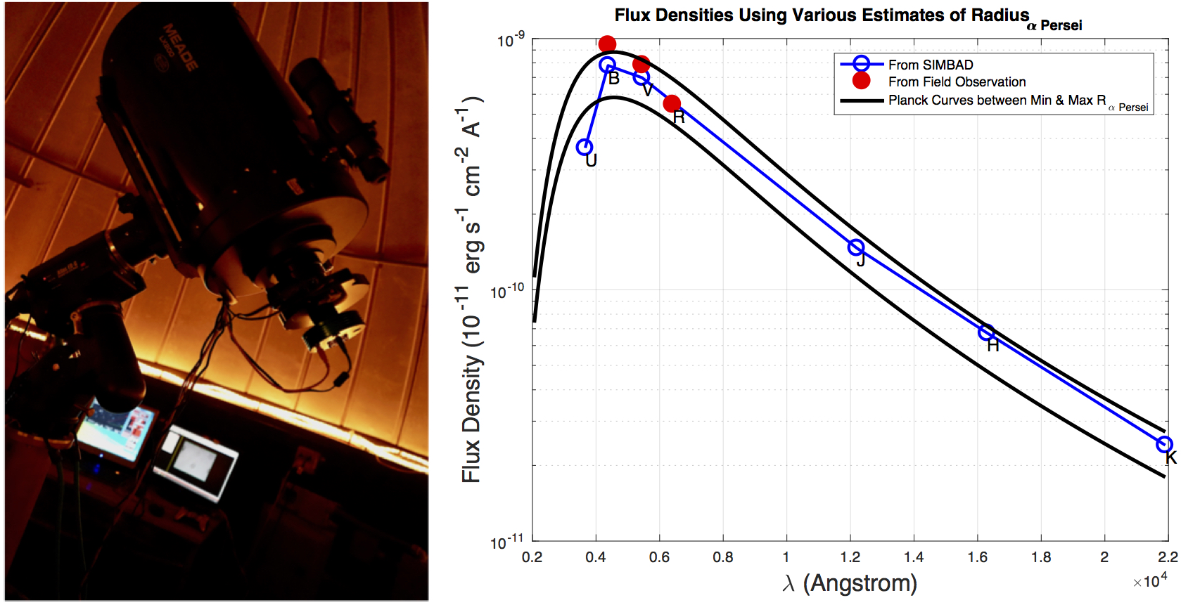
Why would Planck blackbody radiation be my first thought? Two years ago, when I was a math PhD student and had nothing better to do beside research, I took a course in introductory astrophysics. For the course project I was assigned to verify the current estimate of the minimum and maximum radius of the star Alpha Persei (the brightest star in constellation Perseus). Here we study the house price distributions from house sales data and hope to find the mechanism behind pricing. There and then we tried to find the radiation power density distribution (with respect to wavelength) from actual field observation. We know the mechanism (Planck’s radiation law, at least approximately) and hope to establish a link between a star’s radius with its observed radiation power density distribution via such mechanism. (The difference is that to study stars we did actual field work instead of “dplyr”ing data sets, and the field work was to use a large telescope (see the picture to the left below) with a set of wavelength filters to capture and count photons of different wavelengths from a star.) The end conclusion was not surprising that we showed the current estimate of Alpha Persei’s radius was convincing (see the graph to the right below), but it left me a deep impression that how such a simple model (Planck’s radiation law) could help us unlock "secret" messages sent from a star galaxies-far-away!
5. Future Improvement
This project is merely a preliminary examination of NYC real estate patterns. There are a number of possible improvements to apply in the future. They include the following: (1) The Shiny App can be made more sophisticated. (2) More historical data (i.e., not just 2017 Sales Records) can be taken into account in exploring the patterns. (3) The study can be refined to separate houses into finer categories: commercial use, residential apartments, residential one-family houses, residential two-family houses, etc. The lists for improvement can be endless, but, the goal is to discover patterns that are simple to understand and make use of.
Topics from this blog: R dplyr Data Visualization NYC R Visualization visualization prediction data Maps Student Works Shiny R Shiny