
Introduction
Over the past five or so years, there has been an explosion of concern over the ever-increasing political polarization and dysfunction in the United States government, and there's a lot of compelling data to support that claim. My favorite data points are that the current Congress is on pace to pass far fewer bills than any previous Congress in history and the ideological gap between the parties is measurably widening.
I am by no means an optimist, but throughout all the doomy and gloomy discussion of where things are headed, I can't help but wonder if there are some hidden positive aspects of our political climate that are too subtle for anyone to notice, or too sunny to merit a headline. Maybe we'd find there are forces more powerful than partisanship if we knew where to look?
You might think this sounds overly vague or foolishly hopeful. Or both. If that's your reaction, give yourself a gold star: you're right. I put my computer to work looking for a glimmer of hope on this subject, and it did not give me much. The most powerful divides in our politics are well-established and staring us in the face, and the math backs it up.
Background
If I asked you to quickly describe your political ideology, you'd most likely pick a one-word term: conservative, liberal, libertarian, socialist, anarchist, centrist, moderate, independent, progressive, Republican, Democrat, Green, and so on. It makes sense to use these terms conversationally for the sake of being succinct and un-pompous, but in order to analyze ideology, it's important to acknowledge that on their own, these terms are unacceptably imprecise.
Terms evolve in meaning over time and important ideological rifts emerge. By liberal, do you mean classical or modern liberalism? By conservative, do you mean paleoconservative or neoconservative?
Some political descriptors have become stigmatized while others have been lionized. There are societal incentives for us to mislabel ourselves. The West Wing notwithstanding, Democrats studiously avoid describing themselves as “liberal”, whereas Republicans proudly proclaim themselves to be “conservative”.
And finally, these popular one-word labels cannot convey radicalism. Moderate Republicans like Colin Powell and firebrands like Sarah Palin can both be labeled “conservative”, but will still sharply disagree on many issues.

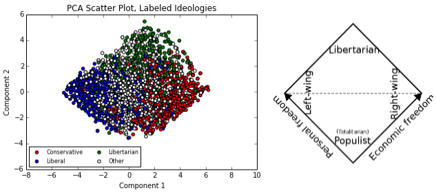
In 1969, in order to more objectively quantify and classify political ideology, David Nolan introduced the Nolan Chart, the above two-dimensional plot. (Nolan's likely primary motivation, though, was to promote the Libertarian party, of which he was a founder.) The chart plots a person's fiscal liberalism/conservatism on the X-axis and social liberalism/conservatism on the Y-axis.
Though the original intent behind it may have been partisan, the Nolan Chart has become broadly accepted. Sites such as The World's Smallest Political Quiz and Political Compass use the Nolan Chart to visualize quiz results and compare political figures' beliefs. The chart's popularity stems from its potent intuitive appeal. Most political issues can be uncontroversially classified as fiscal or social (notable exception: foreign policy issues) and boiled down to questions of whether the government should exercise power or not.
Up until recently, I accepted the Nolan Chart's ideological axes unquestioningly, but it slowly dawned on me that I didn't have to take Nolan's dichotomy on faith. There is a mathematically rigorous way of taking a dataset consisting of a huge amount of variables (political issues, in this case) and aggregating those many variables into a smaller amount of metavariables- two or three, say- while still representing the shape of the original data as faithfully as possible. This technique is called Principal Component Analysis (PCA).
For the less statistically inclined reader, stay with me! All you need to know is that I wanted to create a graph with the same purpose as the Nolan Chart- to visualize political ideology in two dimensions- but instead of simply asserting that the graph's axes should be social and economic, I let my computer determine which axes (usually called “components”) captured the most information in the dataset. Each PCA-generated component can be thought of as a little political quiz.
For example, if we wanted to make a Nolan-like social “component”: Start at 0. If you're pro-life, add 0.2. If you're pro-choice, subtract 0.2. After a series of questions like this, the more positive the score, the more socially conservative the component is saying you are. Ideally, while this score won't tell you someone's stance on any specific issue, it will convey a lot more information about the person's overall ideology than any one-issue variable.
Getting the data
But I'm getting a bit ahead of myself. In order to run PCA in the first place, I needed a dataset describing people's political beliefs. There is probably a suitable file in the public domain, sitting on some website somewhere, but I wanted to try my hand at scraping data, and I had a target in mind: http://www.debate.org. Wikipedia describes data scraping as "a technique in which a computer program extracts data from human-readable output coming from another program." In this case, I wrote code (using Python libraries urllib and BeautifulSoup) that instructed my computer to visit each debate.org user's profile, extract data, then store it in a spreadsheet.
Debate.org is a site where you can argue with strangers for fun. In that regard I suppose it's like a lot of websites. The aspect of the site I was interested in, though, was a table that appears in the bottom left corner of each user's profile page (the below screenshots are for a randomly chosen user):
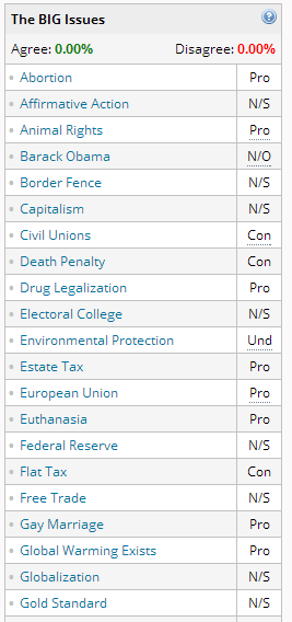
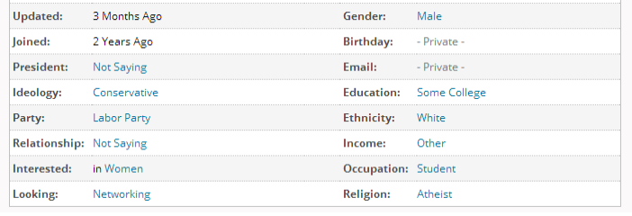
N/S means “not saying”, N/O means “no opinion” and Und means undecided. The first part of my project consisted of writing a script that visited each user's profile page and grabbed all of their (publicly shared) political opinions, along with other self-reported data such as gender and ideology. The other profile data fields I collected were:
Each user was stored as a row in a spreadsheet. After converting all Pro responses to 1, all Con responses to -1, and all other responses to 0, the dataset was of this form:
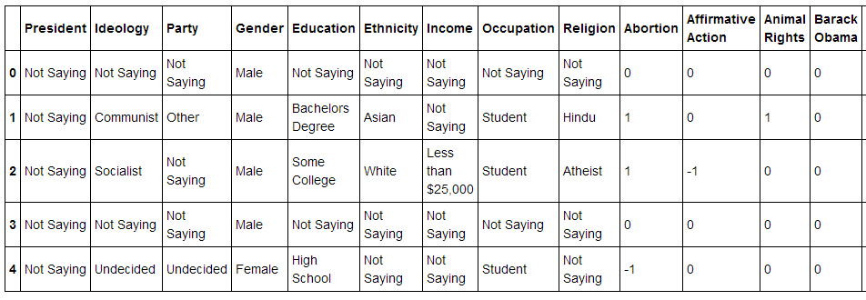
When the data was scraped, the site had 17,775 members, so the dataset contains that many rows. There are 48 political variables (I could only fit about half of them in the screen grab above). Alphabetically, they are: Abortion, Affirmative Action, Animal Rights, Barack Obama, Border Fence, Capitalism, Civil Unions, Death Penalty, Drug Legalization, Electoral College, Environmental Protection, Estate Tax, European Union, Euthanasia, Federal Reserve, Flat Tax, Free Trade, Gay Marriage, Global Warming Exists, Globalization, Gold Standard, Gun Rights, Homeschooling, Internet Censorship, Iran-Iraq War, Labor Union, Legalized Prostitution, Medicaid & Medicare, Medical Marijuana, Military Intervention, Minimum Wage, National Health Care, National Retail Sales Tax, Occupy Movement, Progressive Tax, Racial Profiling, Redistribution, Smoking Ban, Social Programs, Social Security, Socialism, Stimulus Spending, Term Limits, Torture, United Nations, War in Afghanistan, War on Terror, and Welfare.
User attributes
Of the 17,775 site members, 7,286 gave at least one Pro/Con response. In other words, 10,489 users provided no useful ideological data.
Before running PCA or any other in-depth analysis, it's worth examining some surface attributes of the dataset. The one that jumped out the most to me was the gender disparity: Of the users who disclosed their gender, 82% were male. This extreme overrepresentation of men could cause PCA to choose components tailored to best politically classify males, as opposed to people overall. I don't believe this significantly distorted the results, but it's worth noting that it was a potential risk.
Another top-level breakdown of interest is the users' self-identified political ideologies. Of the users who put their ideology on their profile, this is the distribution:
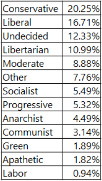
While Conservative is the single most popular ideological label, notice that there are multiple left wing labels- Liberal, Socialist, Progressive, Communist, Green, Labor- whereas Conservative is the only right wing label. Adding up all users who identify as either Liberal, Socialist, Progressive, Communist, Green, or Labor gives just under 33% of users. So despite first appearances, the site's user base has a left wing skew. Another interesting feature of the site's users is that about 11% of them identify as libertarian, a higher proportion than the national figure (this 2013 poll found that 8% of Americans identified with the Libertarian Party, and that 7% of Americans had consistently libertarian beliefs).
The good stuff
Keeping these potentially confounding factors in mind, I ran PCA on the debate.org data to reduce the 48-variable dataset down to 2 maximally information-capturing variables. I'll examine the components it generated in a moment, but first let's see what the political ideology universe looks like when we plot users on these new axes:
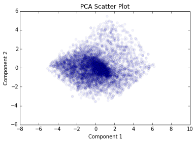
Looks just like a sneeze of points, doesn't it? I figured that PCA would pick up on the red-blue split in the country, and accordingly there would be two large, clearly distinct clusters of points. You could say there does seem to be some clustering, but there's just one cluster, and it's at the very center of the plot. The reason for this is not particularly interesting, though: many site users only gave a small amount of Pro or Con responses. Of the 7,286 users who gave at least one decisive response, 1,137 (16%) answered 5 questions or fewer. I had to assume that a user who didn't answer a given question was on the fence, so the central cluster is deceptive and mostly meaningless.
Does this mean that PCA has failed to detect the very real political factions that exist in the country due to data sparsity? Or perhaps the users of debate.org are so independently minded that their beliefs don't cluster the way we might expect from a representative sample of Americans? Or maybe, most excitingly, has PCA discovered explanatory political variables that defy the conventional wisdom, and people the Nolan Chart would have placed in the same region don't belong together after all?
Before I spent further time mulling those possibilities, I had another arrow in my quiver to see whether the components PCA gave me were organizing the ideological landscape in a traditional fashion: the user-provided ideological labels. What would the scatter plot look like if I colored each point according to each user's ideology?
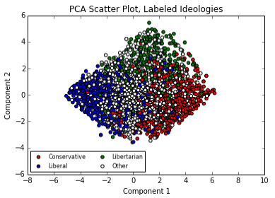
This is when the despair set in. When you color in the dots, the plot really looks like the Nolan Chart, doesn't it? Well, technically it looks like the Nolan Chart rotated 45 degrees, but the main takeaway is that the components PCA chose seem to be describing the exact same ideological plane that Nolan chose. The top region is libertarian, the left hand side region is liberal and the right hand side region is conservative.
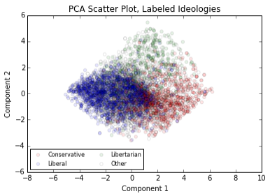
For the sake of completeness, this is the colored plot with reduced opacity:
Component 1 (X axis)
While it certainly looks like PCA has confirmed that the Nolan chart is the best two-dimensional representation of political ideology, maybe the components it picked are very different than we might assume? Let's dig into their composition and find out.
First up: Component 1, the X axis in the red-green-blue scatter plot. Based on the plot, it looks like it's a separator of fiscal/social liberals from fiscal/social conservatives. Here are the top ten highest magnitude coefficients for component 1:
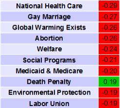
Remember, each component can the thought of as a political quiz. The way to get a high positive Component 1 (X value) score is to be for the death penalty and against the following issues: National Health Care, Gay Marriage, Global Warming Exists, Abortion, Welfare, Social Programs, Medicaid & Medicare, Environmental Protection, Labor Union. If you have all of these views, you'll be plotted near the right hand edge of the plot.
As I expected based on the red-blue separation in the scatter plot, Component 1 seems to have completely figured out the liberal-conservative dichotomy, or more specifically the Republican-Democrat dichotomy. While nine of the above coefficients relate to social or fiscal conservatism, the third largest coefficient is for not believing in the existence of global warming. This is notable because the existence of global warming is not related to political philosophy in any obvious way, but it is a deeply partisan issue, so PCA definitely seems to have concluded that the partisan divide is the most significant dimension to our politics.
Component 2 (Y axis)
Component 1 seemed to capture the Republican-Democrat ideological split, so what signal did Component 2 capture? Based on the colored scatter plot, its function appears to be separating libertarians from everyone else. Self-identified libertarians tend to score high on it, so they appear near the top of the Y axis. Here are Component 2's top ten coefficients:
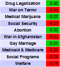
That's a pretty large coefficient for Drug Legalization, about 45% larger than the magnitude of the largest coefficient of Component 1. Having the following positions will give you a high score on Component 2- For: Drug Legalization, Medical Marijuana, Abortion, Gay Marriage. Against: War on Terror, Social Security, War in Afghanistan, Medicaid & Medicare, Social Programs, Welfare. The conventional ideological buckets these positions fall into are social liberalism, fiscal conservatism, and opposition to foreign intervention- the primary features of libertarianism.
Significance
Thus far I've left out a pretty important question. We've established that the two most descriptive dimensions of our politics (at least based on the debate.org data) are Republican-Democrat and Libertarian-Antilibertarian, but just how descriptive are they? When you perform PCA, you invariably lose information. The central tradeoff in PCA is less accuracy for greater ease of comprehension. If the components we just generated only explain a small fraction of the variation (information) in the dataset, we haven't really figured out the structural forces behind the data, which was the purpose of this whole exercise. Just how much accuracy was lost when we reduced the 48 ideological variables down to 2 components?
It turns out that this is easily knowable. Most code libraries that perform PCA calculate these figures automatically. In this case, Component 1 (Republican-Democrat) explains 18.4% of the variation in the source data, and Component 2 (Libertarian-Antilibertarian) explains 7.8% of the variation. So together, the two components account for 26.2% of the variation.
When I first saw the significance numbers, I was surprised. PCA validated that the conventional ideological axes are optimal descriptors, so I was assuming that the conventional wisdom- that those ideologies strongly determine a person's beliefs- would hold as well. But around 74% of the variation in the dataset was not captured by the two components; for this dataset, a person's position on the Nolan Chart is not hugely predictive of their stance on the average issue. There are several reasons why that 74% figure might be deceptively high, though.
One gigantic source of uncertainty in this analysis was the incompleteness of the data. Since users were permitted not to give a stance on an issue, many of the correlations in the data were unnecessarily muddied. Additionally, as briefly mentioned earlier, it's possible that the site attracts a user base that is more contrarian and less doctrinaire than the population as a whole. If this is the case, the ideological correlations would be further muddied.
On the other hand, we should certainly expect a fair amount of unpredictability in people's opinions. There is compelling psychological evidence that we often come up with our beliefs without applying critical reasoning. Critical reasoning only comes into play after we've chosen our stance on an issue, and we use it to further convince ourselves that we're on the right side. As Jonathan Haidt puts it, “We effortlessly and intuitively 'see that' something is true, and then we work to find justifications, or 'reasons why,' which we can give to others.” This emotion-first, reason-last approach to picking our beliefs would definitely give rise to unpredictability in the dataset I worked with here.
Conclusion and next steps
Based on the debate.org user data, the Nolan Chart's plane is the most accurate and descriptive two-dimensional means of measuring ideology. To me, this is somewhat depressing because an agnostic computer- an unfeeling mass of silicon and metal that never watches cable news, doesn't know what political polarization is, and so on- came to the same conclusion as the emotion-driven, not-particularly-quantitative political press: the partisan divide is by far the most important single factor. One crucial detail that's worth emphasizing is that the ideological labels users provided were not visible to PCA. PCA only knew each user's policy positions, and based on the correlations it saw between certain policy positions, it did a pretty good job of determining the traditional ideological groupings.
At the same time, though, these results could be interpreted as simply an affirmation of the conservative/liberal, fiscal/social labeling system. Maybe Nolan just nailed it and PCA agrees, and there's no reason to shoehorn in concerns about polarization.
Either way, more work could be done to elucidate some of the points of uncertainty that came up. If I were to take this further, I would:
- Find a different but comparable dataset, where respondents must give a position on each issue (though truly undecided people could say so).
- Ideally this dataset would be closer to a random sample of Americans, so that we could have more confidence in it being representative.
- Experiment with eliminating certain variables that are less relevant to political ideology (e.g. Term Limits), perhaps this would increase the percentage of variation the first two components can capture.
Topics from this blog: statistics python Web Scraping data Student Works beautiful soup