FHFA Home Mortgage Data Insights
Posted by Radhey Shyam
Updated: May 16, 2016

Contributed by Radhey Shyam. He is currently in the NYC Data Science Academy 12 week full time Data Science Bootcamp program taking place between April 11th to July 1st, 2016. This post is based on his second class project - R Shiny (due on the 4th week of the program).
Introduction:
Federal Housing Finance Agency(FHFA) is an independent regulatory agency responsible for monitoring the secondary mortgage markets consisting of government sponsored enterprises of Fannie Mae, Freddie Mac and the Federal Home Loan Bank
 System. FHFA with its combined entities provide more than $5.5 trillion in funding for the U.S. mortgage markets and financial institutions. It was created in July of 2008 under Housing and Economic Recovery Act of 2008 and under this, the data is made available for public use.
Data:
For this project, I used Single-Family Census Tract File from FHFA website. It consists of data thirty nine columns having detailed information such as gender, race, and age of the borrower as well as the census tract location of the property . I combined the data files from five years from 2010-2014 and final combined consisting of more than 22 million rows and 39 columns. For analyzing such a huge data, I decided to concentrate on some key factors like age, race and gender of the borrowers and co-borrowers from all 50 states.
My aim was to find that is there any difference between the gender, race and age profiles of borrowers and overall trend of the home mortgage data.
First of all, data text files are available separately for Fannie Mae and Freddie Mac enterprises and by years wise from 2014 to 2010, so I have to load the text files into the local df by year wise and check their dimensionality and repeat the process for years from 2014 to 2010.
https://gist.github.com/rshyam1/e354fd774663b867fda4a998b06525d6
There are no missing values in the datasets but there are numerical codes for not available and not available values.For example , there were 171 rows out of 1.89 million rows ( less than 0.010 percent) that have missing state codes in 2014 Fannie Mac data files and there were no missing state codes in Freddie Mac file in all years. Similarly for all years, Fannie Mae files have less than 0.010 percent missing state codes and surprisedly, Freddie Mac have no missing state codes. So, for practical purposes, I decided to delete missing state codes rows than rather imputing them.
https://gist.github.com/rshyam1/a5bbff13347eabb508838c9de2eb3876
Repeating the same steps for checking for missing of values for all other years .Finally , I bind all the rows together and final data frame contains more than $22 millions rows.
https://gist.github.com/rshyam1/93b3cb230aa86fe8eb8346815d942fc6
Now, I decided to created another data frame having summary of state-wise results because Shiny web was very slow and took lot of time for loading such a large date-frame. Also, the data contains only state codes, I have to create another table for state codename from R's state.abb and state.name . But it has information for only 50 states . But I verified and found that our data set contains 54 state codes , So I have to found additional codes from MSA files for DC,GUAM, ADJUNTAS MUNICIPIO and ST CROIX ISLAND . Then, I manually inserted then into the state full name table. For finding state wise results, I decide to first group_by year, then by state code and finally by gender and summarize the final group_by df by gender count.
https://gist.github.com/rshyam1/5fa6632260cd07dd04cc9af56e793232
Designing and creating the Shiny App:
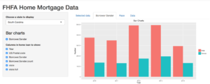
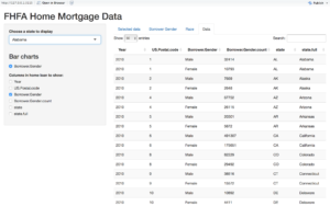
After the data has been summarized into a smaller data frame, it was faster to run the shiny app. As it is a massive data, I decided to add a select box to select the state and user can also select the columns to display in the data or all data can be loaded into data tab. Below is the snap shop of the app
By selecting the state,we can see the bar chart of gender profile of Borrowers in the state for last five years.
We can also see the summarized data of all the states.
We can select any state , the data will load instantly to show the gender profile of the borrowers.I am also in the process of adding some more columns for analysis for example age, race and income profile of the borrowers.
Conclusion:
Once the data was clean and then main part challenge was how to organize such a large data ( more than 22 million rows) for viewing. The main challenge was how to design the data for summary .Once I figured out that , then it was smooth process. The Shinny was fun to work and did not require much coding , the only trick part was how to make your data/bar graphs change to inputs(by making data reactive) .
I would like to add more factors/tabs to the app in the future.
Radhey Shyam
Radhey Shyam received his Ph.D. in Physics from Clemson University, USA and M.S. (Computer Science & Engineering) from GJU of Science & Technology, India. Radhey Shyam did his master's thesis on Network Monitor System, where he applied innovative idea of parallel processing using multiple threads in VC++, which make the network monitoring process faster by ten times and hence, was awarded distinction for his thesis work. During his first two years in Ph.D., he worked in Computational Physics lab, utilizing Clemson University's high-performance computing (HPC) resources to make top ten predictions of protein-protein docking algorithms. Then, he switched field to Experimental Physics and worked on inter-disciplinary project with Electrical & Computer Engineering to fabricate Metal-Oxide- Semiconductor(MOS) capacitors, to study the energy loss of single charged and multiple charged ions in MOS dielectric films. Currently, he is honing his analytical and computational skills in Data Science and looking for a position in industry.
View all articlesTopics from this blog: R Student Works R Shiny

