Introduction:
This project is linked to my last project which is "Visualisation of Us Domestic Flights in year 2009". According to the last project , there is a pattern of passengers movement from North to South in December of 2009. However, it is hard to say weather it is a special case of year 2009 or it was a generic pattern for every year. Additionally, due to the lack of data on time scope, it is hard to see how air traffic and airport is changing through the year.
Thus, I decide to do further research by using the US domestic flights data from 1990 to 2009. The following are the initial questions that the report is going to figure out: how much percentage the air traffic is increasing during the 20 years. What is the trend of air traffic of US domestic flights from 1990 to 2009. How is the performance of commercial airports vary by year and by month. Is there exist a common distinct pattern of passengers movement by month of each year. Moreover, there is a way to compare the airports performance by categorising the airports in to groups. So I wonder the differences between the different groups of airports.
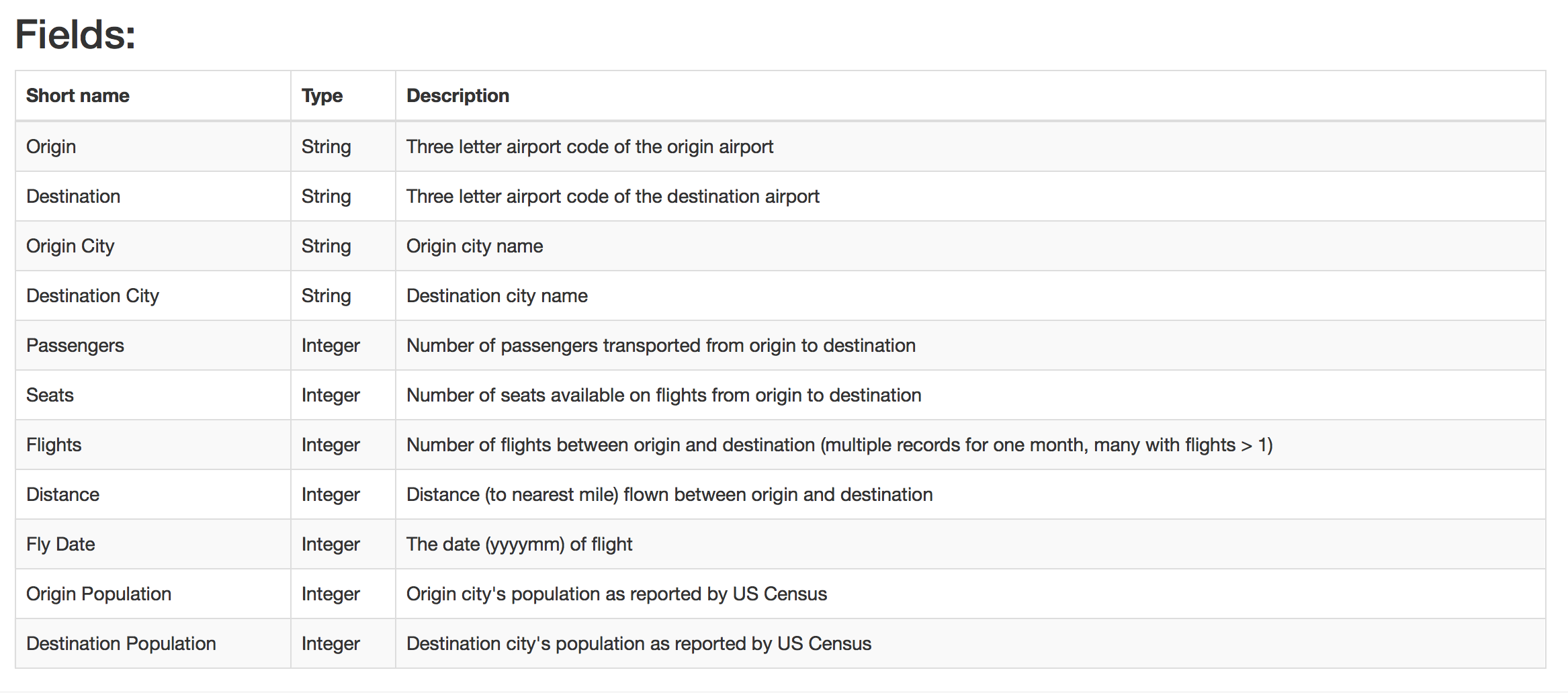
I. Origin Data Set Description
Abstract:
The origin data set is over 3.5 million monthly domestic flight records from 1990 to 2009. Data are arranged as an adjacency list with metadata.
Source(s)
1.US Census Bureau
2.RITA/Transtats, Bureau of Transportation Statistics
Year: 2009
URL:http://academictorrents.com/details/a2ccf94bbb4af222bf8e69dad60a68a29f310d9a
II. Data Manipulation & Methodology
1.Pre-prepare for the data
In order to answer the questions in the introduction, I manipulate the origin dataset by adding the location (longitude and latitude) of each airport. I also add the information of state for each airport. Moreover, according to the FAA(United States Federal Aviation Administration)principle of categorising the airport, most of the airfields that qualify for funding are commercial service airports , which are more dependent on regularly scheduled commercial airline traffic.There are two subcategories under the commercial service airport: primary airports and non primary airports, which is base on weather the airport is handling more than 10,000 passengers each year. In regard of this, I grouped the data by year and airport and then filter the total passengers that over 10,000, thus I only keep for the primary airports. After that, I categorised the each primary airport by following the FAA principles on Primary Airports:
- Nonhub primary – airports handling over 10,000 but less than 0.05% of the country's annual passenger boardings
- Small hub primary – airports with 0.05 to 0.25% of the country's annual passenger boardings
- Medium hub primary – airports handling 0.25 to 1% of the country's annual passenger boardings
- Large hub primary – airports handling over 1% of the country's annual passenger boardings
Furthermore, in order to visualise the passenger movement pattern, I first group the data by origin airport and then summarise the monthly outflow of passengers. Secondly, I group the data by destination airport and then summarise the monthly inflow of passengers. Then I could merge this two dataset and named a new column which is the number of net flow passengers ( inflow of passengers - outflow of passengers) .
Finally, the data set for analysing is done (RawCode for data manipulate) and below is the snippet of the data:
tbl_df(data)
# A tibble: 61,677 x 14
 Airport Year Month City State AirportType Occupancy Population Netflow
 <chr> <int> <int> <chr> <fctr> <chr> <dbl> <dbl> <int>
1 ABE 1990 5 Allentown, PA Pennsylvania SmallHub 0.5331442 688334 55
2 ABE 1990 1 Allentown, PA Pennsylvania SmallHub 0.5182120 688334 -2444
3 ABE 1990 6 Allentown, PA Pennsylvania SmallHub 0.5659226 688334 -1382
4 ABE 1990 2 Allentown, PA Pennsylvania SmallHub 0.4912840 688334 -1308
5 ABE 1990 9 Allentown, PA Pennsylvania SmallHub 0.4476937 688334 -1377
6 ABE 1990 8 Allentown, PA Pennsylvania SmallHub 0.5527455 688334 286
7 ABE 1990 12 Allentown, PA Pennsylvania SmallHub 0.4922054 688334 -347
8 ABE 1990 7 Allentown, PA Pennsylvania SmallHub 0.5948180 688334 -821
9 ABE 1990 3 Allentown, PA Pennsylvania SmallHub 0.5490865 688334 -347
10 ABE 1990 10 Allentown, PA Pennsylvania SmallHub 0.5345814 688334 -579
# ... with 61,667 more rows, and 5 more variables: Passengers <int>, Flights <int>,
# Name <chr>, latitude_deg <dbl>, longitude_deg <dbl>

str(data)
'data.frame': 61677 obs. of 14 variables:
 $ Airport : chr "ABE" "ABE" "ABE" "ABE" ...
 $ Year : int 1990 1990 1990 1990 1990 1990 1990 1990 1990 1990 ...
 $ Month : int 5 1 6 2 9 8 12 7 3 10 ...
 $ City : chr "Allentown, PA" "Allentown, PA" "Allentown, PA" "Allentown, PA" ...
 $ State : Factor w/ 50 levels "Alabama","Alaska",..: 38 38 38 38 38 38 38 38 38 38 .
 $ AirportType : chr "SmallHub" "SmallHub" "SmallHub" "SmallHub" ...
 $ Occupancy : num 0.533 0.518 0.566 0.491 0.448 ...
 $ Population : num 688334 688334 688334 688334 688334 ...
 $ Netflow : int 55 -2444 -1382 -1308 -1377 286 -347 -821 -347 -579 ...
 $ Passengers : int 65987 56858 69198 55220 57687 73194 51623 67475 65941 68111 ...
 $ Flights : int 1304 1245 1279 1128 1222 1347 1149 1343 1253 1300 ...
 $ Name : chr "Lehigh Valley International Airport" "Lehigh Valley International Airport" "Lehigh Valley International Airport" "Lehigh Valley International Airport" ...
 $ latitude_deg : num 40.7 40.7 40.7 40.7 40.7 ...
 $ longitude_deg: num -75.4 -75.4 -75.4 -75.4 -75.4 ...
2. Create the Shiny app by using the data above.
All my analysis is based on the dataset above and I use this data to create a shiny app for users to check my analysis and could research by themselves , if they feel more interested in other aspects which I may did not cover in my analysis. Here is the link for connected to my shinyApp . All the raw code of creating shiny app could be found by here :RawCode of ShinyApp
III. Data Analysis
1. Total Trend of AIR traffic and Passengers from 1990 to 2009
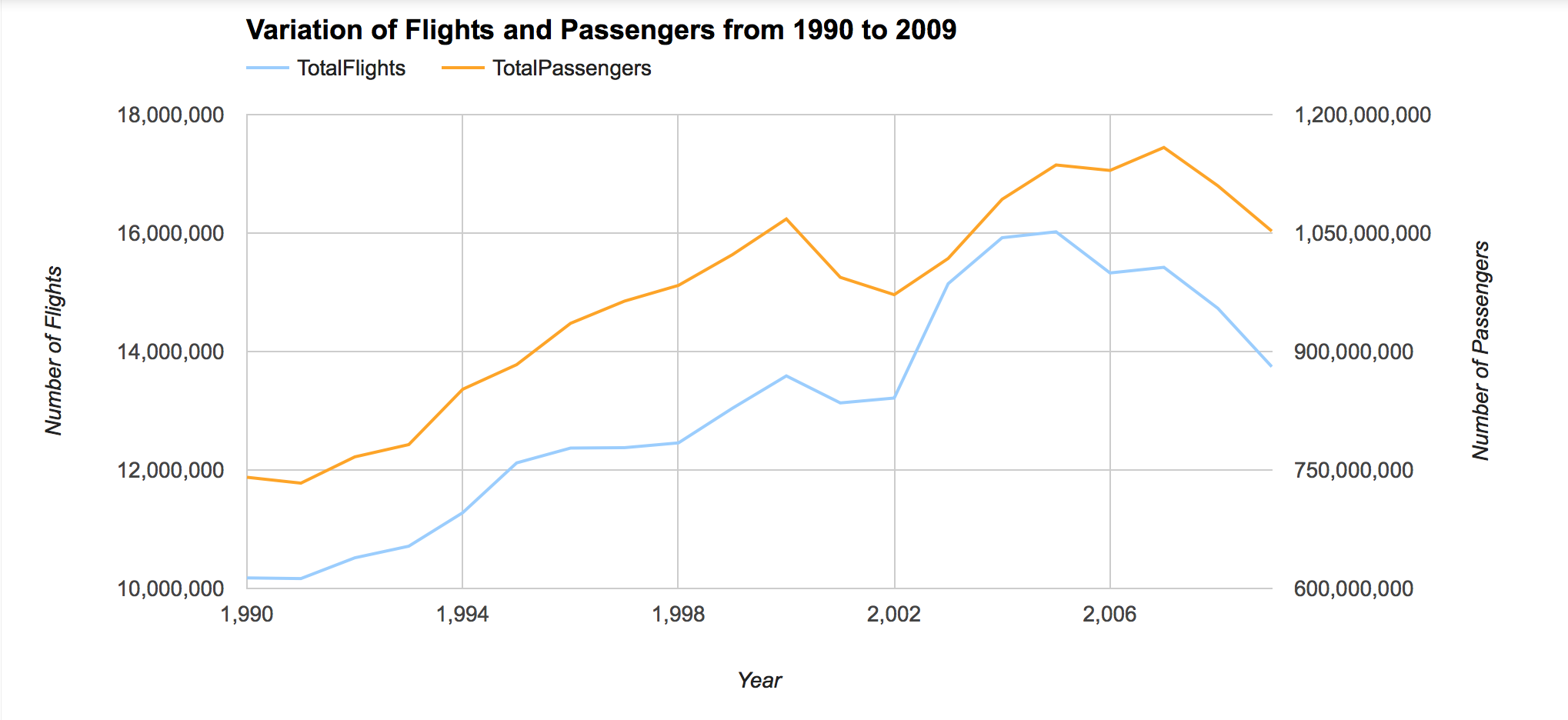
During the 20 years, the number of total domestic flights in US have increased by approximately 35% , while the quantity of Passengers have increased by around 42%. However, the quantity of flights and passengers both plunge during the year 2000 to 2002 and the year 2007 to 2009. The quantity dropped by 9% in passengers and 10% in flights during the period of 2007 to 2009. The reason maybe because of 911 attacks happened on 2001 and financial crisis of year 2008.
2. Airport Categorise
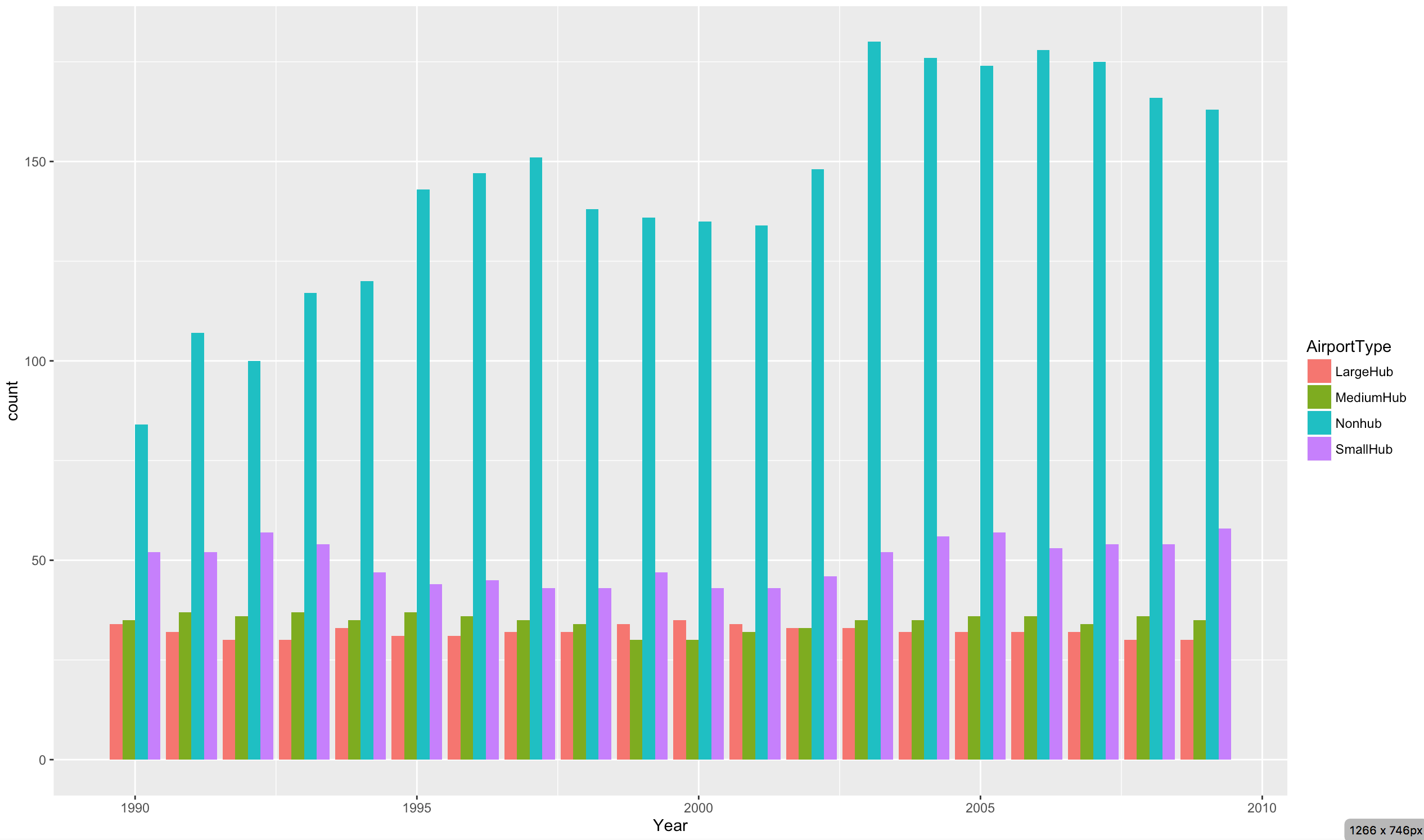
There are four groups of primary airports : N0nhub, SmallHub,MediumHub and LargeHub. From the above bar chart , we can see only the number of N0nhub airport type increased a lot since 1990. Until 2009, there is 163 NonHub airport, which is approximately double the number of NunHub in 1990.The variation of other airport type during the 20 years is not that obvious.
A interesting thing is some of the airport underwent the change of Airport Type by year. Here is the some interesting findings from the shiny app.
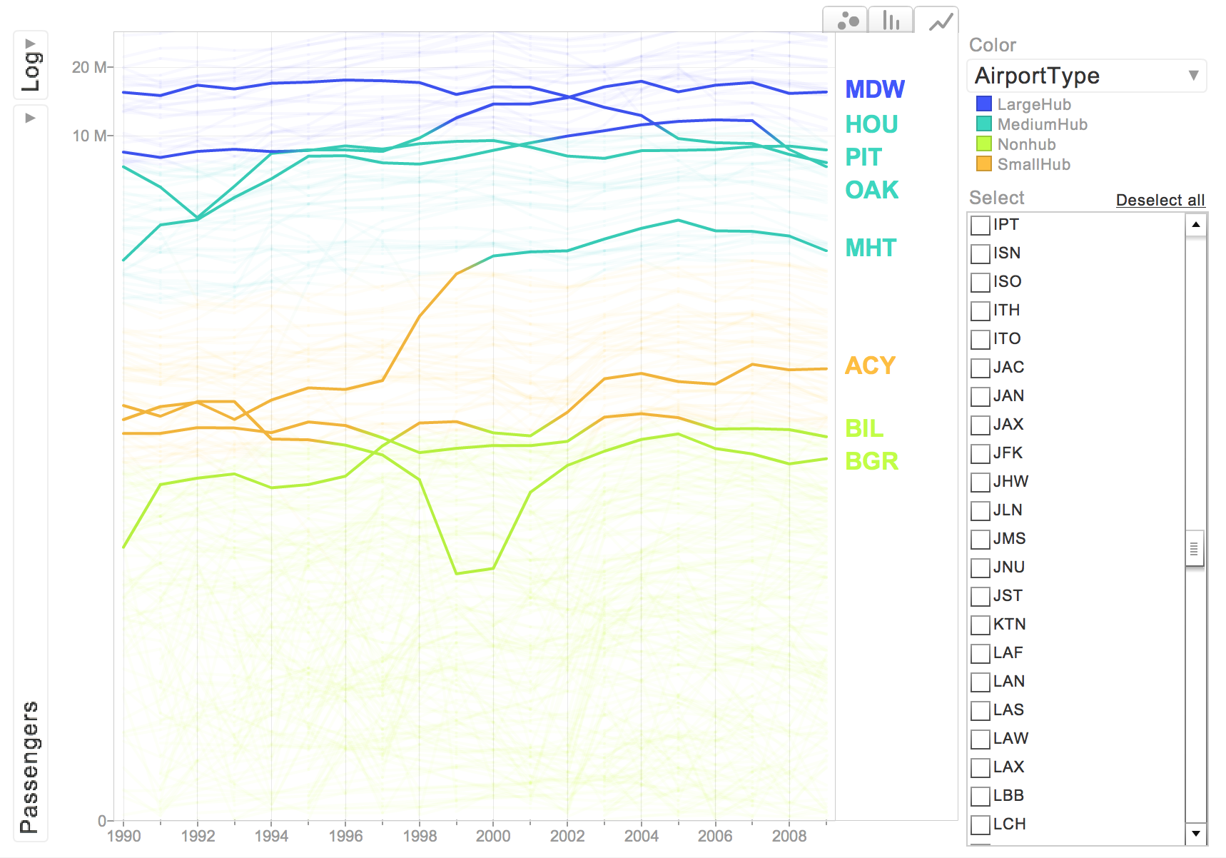
The airport MDW is a MediumHub during the 1990 to 1998 and then became a LargeHub after 1998, while MHT airport became a MediumHub after year 1998.
3. Occupancy level of Airport
From the ShinyApp, we could also check how is the occupancy level for each airport.The occupancy rate reflects of the occupied level of seats compared to the whole capacity of the airport. Generally speaking, the occupancy level in each group is increasing by year as the colour of the point getting more and more dark.However, the occupancy level of NunHub group is less than that of other groups in each year. Moreover, the LargeHub always retain the high level of occupancy.
However, it is better to plot the flights number and occupancy level together to check how well the occupancy is for each airport.
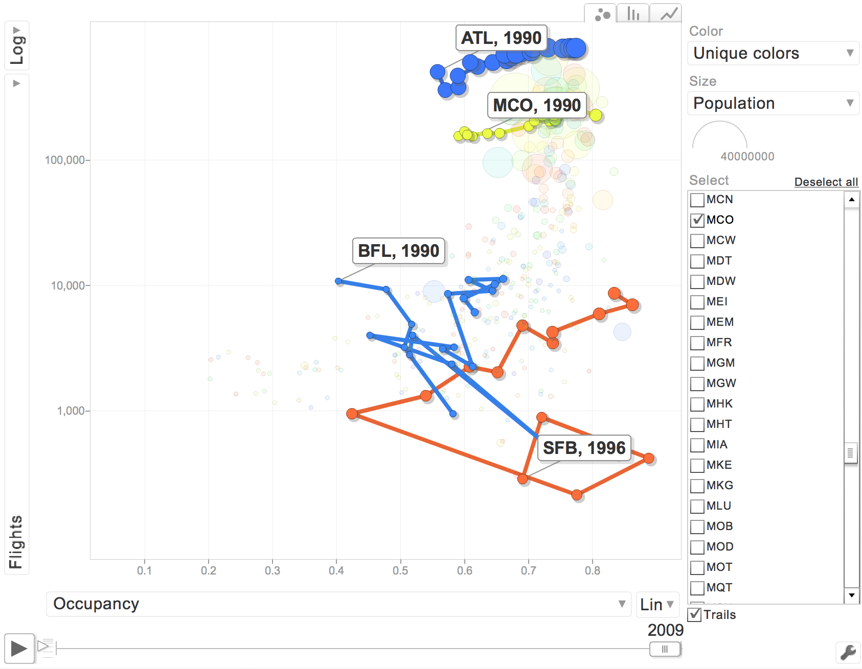
The above graph is from motion chart yearly tab, and select flights Vs Occupancy. I find out that ATL and MCO airport are occupancy rate and flights are positive related, which is normal. However, SFB and BFL occupancy is not that good. For SFB, we can see that the flights number was increasing a lot from 1999 to 2000 , however the occupancy rate is decreasing by 45%, which means the SFB airport during the period of 1999 to 2000, the number of flights increased while occupancy level decreased. Thus, the SFB airport at that time is not that efficient, although the flights number was increasing a lot.
4. Passengers Movement
In order to find the pattern of how the passengers are moving by air, it is better to check the net flow of passengers in each state, to general get the idea of how passengers are moving from different states. By the way , in order to plot the map, I put the city of DC Washington into Maryland state.
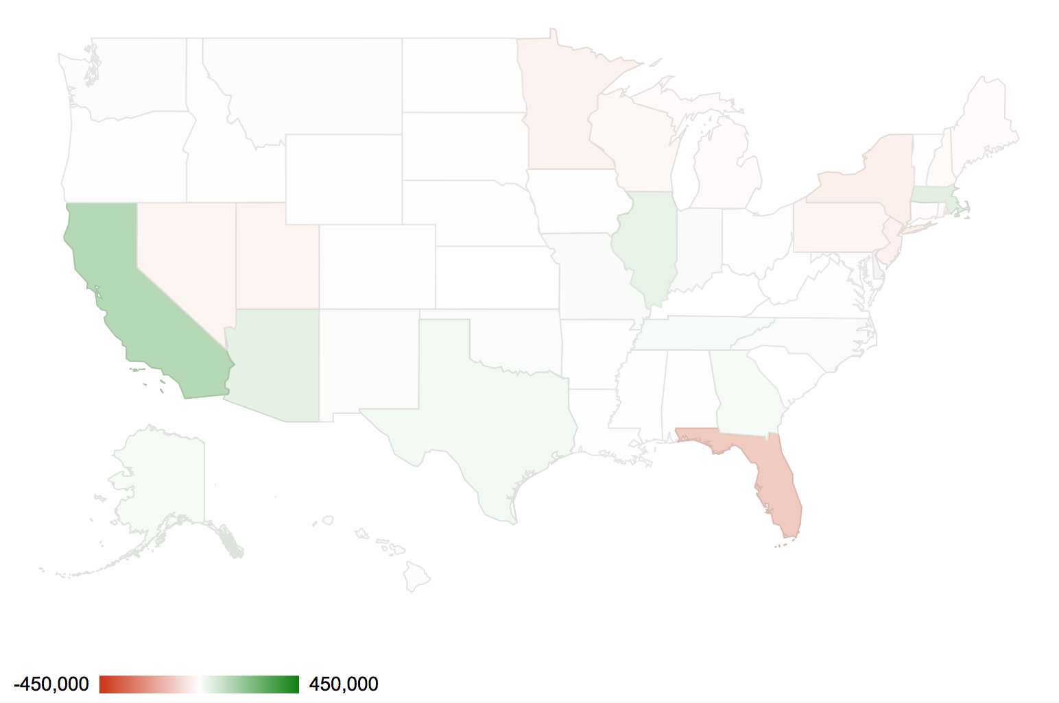
The above graph is the year 2008 , month 1 data to plot the map, and the colour scale is vary by the number of net flow of passengers. If the net flow is positive, there are more passengers come to this state by air. On contrary, if the net flow is negative , it means there are more passengers go out of thus state. The deeper the colour of red , the bigger the negative net flow is, while the deeper he colour of green, the bigger the positive net flow is.
The interesting finding from the motion map in the ShinyApp, there is a common pattern of passengers movement during the end of the year(December) to the beginning of the next year ( January ), there is always more people went out from north part of US to south area of US at the end of the year , especially went to the Florida , the Southeast State in the US. While, there is more people leave from South part of US , e.g. Florida State, to the North of US. In other words, the distinct pattern found in year 2009 is not the special case of that year. The reason should be the winter holiday( Christmas) and weather at that time, so the passengers are prefer traveling to south part of US by using the christmas holiday.
Another factor should be raise , when change the year and month , the North West area of US always have the very light colour. This phenomenon maybe account for the geography and population of the state.
IV. Conclusion
- The number of total domestic flights in US have increased by approximately 35% and the quantity of Passengers have increased by around 42% during the 20 years.
- The quantity dropped by 9% in passengers and 10% in flights during the period of 2007 to 2009, may be because of the financial crisis in year 2008.
- The general occupancy level for each airport type is increasing , which means basically the airport operation was improving during the 20 years.
- The occupancy level of NonHub airport is lower compared to other type of airports.
- Specifically, the performance of each airport should be analysed by plotting flights and occupancy level together to check weather the number of flights increase will cause the occupancy level increase or decease.
- There exists a common distinct pattern of passengers movement between the end of the year and the beginning of the next year , due to the Christmas Holiday and weather affections.
Welcome to view the ShinyApp to check my analysis.
All the Raw Code is available to check here:
Topics from this blog: Student Works