 Background
Exoplanet (meaning a planet that orbits a star other than the sun) discoveries are exciting because each new exoplanet could be the planet on which we discover extraterrestrial life. In aggregate, the tremendous success of exoplanet search projects suggests that exoplanets might be common among stars in the universe. The likelihood that life even remotely similar to life as we know it exists elsewhere is a function of how likely planets that can support life are to form around a given star. Therefore, the search for and study of exoplanets is critical to our understanding of our place in the universe.
The search has just begun. The first exoplanet was confirmed as such only in 1992. Only recently have modern prolific search methods been developed. Research teams use various techniques to search for candidate objects, then review them and determine if they can be reasonable be sure that the object is a planet. Then, the planet is added to the list of confirmed exoplanets, which can be found at exoplanet.eu, the source of my data for this project.
App
I created a Shiny app to visualize some of the properties and methods of discovery of the ~4,000 exoplanets discovered to date. I envision this app as an educational tool that invites the user to questions the meaning of the data and instill a sense of excitement about exoplanets. See the app here.
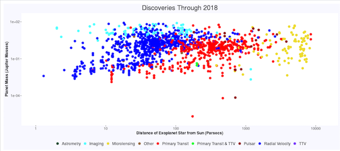
The first page contains a large scatters plot of most of the exoplanets, with distance from earth and mass as the log-scale axes. The points are colored to show which method was used to discover the exoplanet. The user can move a slider to show all discoveries through a given year. Moving the slider helps one to understand the magnitude of the exoplanet explosion in recent years. The coloring of the different methods shows that certain methods seem to be better at discovering very distance planets or less massive planets. Some internet searching shows that this is true. For instance, the Kepler mission discovered many smaller, earth-like planets that were confirmed in 2014 using the transit method. The transit method involved measuring drops in a star's brightness that are caused by an object regularly passing in front of it, like a planet. It requires a powerful telescope and can be used to detect smaller planets than microlensing, which involves measuring light distortion due to distant, massive objects such as large planets.
The second page contains two graphs that show the productivity of each method by year and the overall productivity of each method. Users can hide data from any method using check boxes in the side bar, and the graphs readjust. Each method retains the color is had on the scatter-plot on the previous page, regardless of which methods are "turned off" in the sidebar. I learned that you can assign colors to specific categories in ggplot2 regardless of filtering out certain categories by passing a named vector to the color argument when creating the graph.
The next page allows the user to visualize the orbits of the planets. The user can select a star from a drop down menu, and a flash widget will show the path of all the planets that orbit that star over 2,000 earth days. I thin this page brings the exoplanets to life, and I hope it will inspire users to want to learn more about orbital mechanics and the planets themselves. The shape and speed of the orbits are correct. If multiple stars orbit the same planet, the orbits may be offset from one another. The isn't enough data to compute this offset, so I assumed no offset. I used Kepler's laws to compute the path of each planet given the semi major axis and eccentricity of the orbit. It was difficult to get the flash widget, which is generated by the GoogleVis Motion Chart to work properly with R Shiny. Among other adjustments, I used the htmlOutput function instead of the plotOutput function. I invite you to take a look at the code repo.
Future Work
I hope to improve the project in a few ways. I think making the first page's slider a two-point slider could add usability by allowing the user to see any time-periods discoveries, instead of just to-date discoveries. I also think adding some way to see the number of discoveries in a given year could be important information. I may change the first graph on the second page to a stacked graph of the number of planets discovered by method, instead of percentage of discoveries by method.
Thanks!
If you enjoy my app or have any feedback for me, please email me at johnsumnerbentley@gmail.com or visit my website. Thanks!
Topics from this blog: R R Visualization R Shiny